| Author | Thread |
Comments Made During the Challenge  |
|
|
09/15/2002 04:29:00 PM |
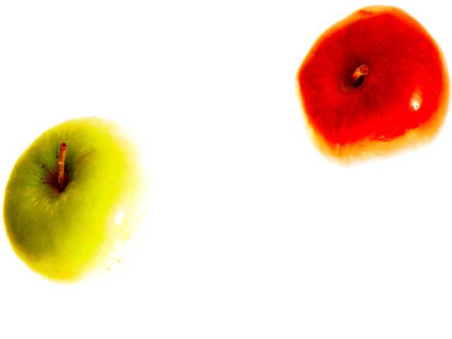
| Neat idea with the lighting. I may have liked this more if the apples were arranged differently...together rather than apart. Lisa |
|
|
|
09/15/2002 04:10:00 AM |
| weird effect, but it works - 8 |
|
|
|
09/14/2002 04:57:00 PM |
Composition - quite good
Technical Aspects - good, too bright for me. focus on the red apple?
Meets Challenge - yes
Visual Impact / Originality – high
Other suggestions –
6
Jim msp
|
|
|
|
09/14/2002 12:41:00 PM |
| The brightness of the background seems to take away fromt eh two apples |
|
|
|
09/14/2002 12:12:00 PM |
| Unique idea, and good colors. Good luck in the callenge. Gracious aka Grayce |
|
|
|
09/14/2002 09:56:00 AM |
|
|
|
09/13/2002 02:22:00 PM |
|
|
|
09/13/2002 02:15:00 PM |
| Interesting composition and framing. I like the contrast of the red and green and teh detail shown on the green apple. karmat |
|
|
|
09/13/2002 05:23:00 AM |
|
|
|
09/11/2002 08:12:00 PM |
Composition: Subject Placement, Cropping, Background5,
Technical: Focus, Exposure, Lighting, Processing6,
Appeal: Is it Interesting, Motivating, Etc.? 4,
Total Averaged Rating5. Autool
The blend from subject to background is very disturbing to me, as well as the extreme distance between apples. |
|
|
|
09/11/2002 04:00:00 PM |
Soooo cool. Seems like a risky pic to enter..lol. Personally, I like the over exposure/contrast - when done well....and this is done well. I like the fact that only the tops are shown and different types of apples. The composition really works for this. Now looking at the title....ok, yes, I can imagine looking up at the sun and seeing these two apples falling. Great work 9
Ruthann |
|
|
|
09/11/2002 09:42:00 AM |
| Nice, experimental idea. I like the way you used lighting and overexposure in this :). |
|
|
|
09/10/2002 04:12:00 PM |
| Interesting effect... The brown edge around the red apple looks a little strange to me. That may be a remnant of the post processing maybe? good shot :) - jmsetzler |
|
|
|
09/10/2002 02:21:00 PM |
Technical: Exposure/focus/composition - 4
Style/originality - 4
Overall 4
Too much light for my tastes. |
|
|
|
09/09/2002 11:25:00 PM |
| I'm not a big fan of the more abstract images... This one doesn't tell me anything. 4 sjgleah |
|
|
|
09/09/2002 07:02:00 PM |
You had to be going for an overly blown out look, you got it. I, personally, don't care for this effect, but you have lots of negative space! (a little early.....)
7 Swash |
|
|
|
09/09/2002 10:45:00 AM |
| The contrast is great, but the apples are not quite in focus. |
|
|
|
09/09/2002 09:18:00 AM |
| Fantastic shot – great idea… (8) |
|
|
|
09/09/2002 01:52:00 AM |
| I like this picture. Maybe it should have been untitled? |
|
Home -
Challenges -
Community -
League -
Photos -
Cameras -
Lenses -
Learn -
Help -
Terms of Use -
Privacy -
Top ^
DPChallenge, and website content and design, Copyright © 2001-2026 Challenging Technologies, LLC.
All digital photo copyrights belong to the photographers and may not be used without permission.
Current Server Time: 02/01/2026 06:32:43 AM EST.