| Author | Thread |
|
|
06/15/2007 12:44:57 AM |
| Mighty fine pic! Lighting is tremendous |
|
 Photographer found comment helpful. Photographer found comment helpful. |
|
|
06/14/2007 07:11:27 AM |
| the shadow is great, just as you know it to be. a wonderful image. |
|
| Photographer found comment helpful. |
|
|
06/12/2007 10:52:36 PM |
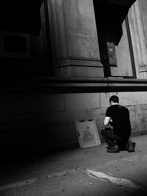
I have to say..let this be a lesson to you..shooting from the hip is not worthwhile, because when you look up you find art...and yes I mean that, this is not something the hip knows, this is something the eye sees, that busy brain of yours captures..
I am immensely disappointed that you didn't achieve one of your profile goals with this shot..being mistaken for me..:)
and now I can't say it is good, or I would sound like an idiot...ok it is more like  boysetsfire... boysetsfire...
I like it! |
|
| Photographer found comment helpful. |
|
|
06/09/2007 04:46:14 PM |
In a themed challenge this would have scored a lot higher, I bet. No northern light, big cat or sky for free study - hey. That said - this is an awesome shot. Love the contrasts and the composition - very wonderful.
Regarding candids... I just shoot without shame and so far nobody has protested. The only time I was yelled at was when I took photos of a truck. So try it. Also, if you point your camera at people for a while, they lose interest and start going about their business - et voila! A candid! |
|
| Photographer found comment helpful. |
|
|
06/08/2007 03:16:26 PM |
| Very nice. The shadows help form the light path to the subject. And the artist and subject of the painting seem to be echoes -- very similar positions. I like the height of the columns and the simplicity of the whole image. The more I explore it, the better I like it. |
|
| Photographer found comment helpful. |
|
|
06/08/2007 12:57:14 PM |
| Lots of levels to this: a study of a figure studying a figure. Makes me want to know more about the shot. Well done! |
|
| Photographer found comment helpful. |
|
|
06/08/2007 12:18:11 PM |
| Nice mood to it - I like how the patterns in the concrete foreground form an arrow that leads you right to the drawing. |
|
| Photographer found comment helpful. |
|
|
06/08/2007 08:35:49 AM |
| Don, you should be very pleased with this image! It is moody, interesting, and has a great tonal range. Makes me want to know more about the subject. Your work has been excellent recently. |
|
| Photographer found comment helpful. |
|
|
06/08/2007 08:16:43 AM |
| Very nice job Don, I love the darkness. You really did a good job of containing the shadows. |
|
| Photographer found comment helpful. |
|
|
06/08/2007 04:43:04 AM |
| It's because people decide what they want to/think they ought to see, and they don't look at what they're being shown. What is all this 'too much dark'? Are they mad? Tantamount to saying 'your photograph ought to be different' and that is, actually, quite offensive. |
|
| Photographer found comment helpful. |
|
|
06/08/2007 01:36:46 AM |
| The shadows makes it look like the artist's real world is incomplete just like that of the artwork. |
|
| Photographer found comment helpful. |
|
|
06/08/2007 12:22:33 AM |
| I think Nick and Sevil are good influences on you. :-) From out of the darkness... Can't find anything I don't like about this - the shadows, the lines, the angles, the textures. Very nice work indeed. |
|
| Photographer found comment helpful. |
Comments Made During the Challenge  |
|
|
06/07/2007 10:15:05 PM |
| nice b/w image - love the lighting so that the student is the only thing illuminated |
|
| Photographer found comment helpful. |
|
|
06/07/2007 09:51:29 PM |
| Interesting shot with the shadows and lighting. I like the mood of it. |
|
| Photographer found comment helpful. |
|
|
06/07/2007 07:39:42 PM |
| This type of photo resonates well with me. Unfortunately this crop really holds the shot back. The big blob of black doesn't add to the image, and really pulls the eye away from the subject. The subject and the detail behind it make this image, I would love to see the crop display them more prominently. |
|
| Photographer found comment helpful. |
|
|
06/07/2007 05:25:32 PM |
| this really is quite striking when you come across it. the darkness leads you to the subject. nice elbows. |
|
| Photographer found comment helpful. |
|
|
06/06/2007 04:40:42 PM |
| Nice shot. I like the dark part contrast with the light side. |
|
| Photographer found comment helpful. |
|
|
06/05/2007 08:57:09 PM |
good choice. i love the composition and the balance of light-dark in this.
comment- only :) |
|
| Photographer found comment helpful. |
|
|
06/05/2007 07:10:40 PM |
| good capture a wee bit dark to the left a tad more contrast but solid capture i give it a 8 |
|
| Photographer found comment helpful. |
|
|
06/05/2007 04:02:26 PM |
| interesting lighting. good tonal range |
|
| Photographer found comment helpful. |
|
|
06/05/2007 03:12:08 AM |
|
| Photographer found comment helpful. |
|
|
06/05/2007 01:30:00 AM |
| nice effort little too dark on the left and that takes away from it |
|
| Photographer found comment helpful. |
|
|
06/04/2007 10:36:09 PM |
| The big black spot on the left side of the photo is distracting from the focus of the image. |
|
| Photographer found comment helpful. |
|
|
06/04/2007 07:17:07 PM |
| I think what I enjoy most about this image, among many things, is how the artist closely mimics the subject in pose...very nice. |
|
| Photographer found comment helpful. |
|
|
06/04/2007 05:41:06 PM |
I'd really like to like this more, but it just doesn't work for me. the large rectangular areas above are just too dominating, the lines not strong enough except the too strong line dividing the middle
6
Jack |
|
| Photographer found comment helpful. |
|
|
06/03/2007 04:38:50 PM |
| That blackness on the left is really distracting to me. Otherwise the rest of the photo is well done, I nice B&W conversion. |
|
| Photographer found comment helpful. |
|
|
06/03/2007 01:22:22 PM |
| Love the shadows on this. How was this achieved? |
|
| Photographer found comment helpful. |
|
|
06/03/2007 12:54:26 AM |
| The shading/burning is interesting. Gives the composition balance and enhances the angles and focus. |
|
| Photographer found comment helpful. |
|
|
06/02/2007 01:39:41 PM |
| I don't like the blackness coming in from the left and the bottom right. It almost looks like your finger was over the lens, but it was probably just an intense shadow? Either way it's very distracting. |
|
| Photographer found comment helpful. |
|
|
06/02/2007 12:43:36 PM |
| nice composition I find there is a bit too much shadow and it overwhelms the shot a bit too much |
|
| Photographer found comment helpful. |
|
|
06/01/2007 09:37:31 PM |
| Somehow the tilt (pillars) doesn't look right. Color would be better too. |
|
| Photographer found comment helpful. |
|
|
06/01/2007 07:48:45 PM |
| Good composition but too much dark area. |
|
| Photographer found comment helpful. |
Home -
Challenges -
Community -
League -
Photos -
Cameras -
Lenses -
Learn -
Help -
Terms of Use -
Privacy -
Top ^
DPChallenge, and website content and design, Copyright © 2001-2026 Challenging Technologies, LLC.
All digital photo copyrights belong to the photographers and may not be used without permission.
Current Server Time: 02/01/2026 09:17:58 AM EST.