| Author | Thread |
Comments Made During the Challenge  |
|
|
05/27/2007 11:24:09 PM |
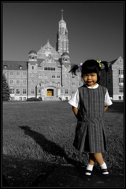
| I like this except the door should not have been in colour...and why is one ribbon yellow and the other not...makes it look a little sloppy in the edit...nice otherwise 6 |
|
|
|
05/26/2007 03:44:30 PM |
Just outa curiousity, why did you decide to leave the door in color?
TC |
|
|
|
05/25/2007 06:30:03 PM |
| very nice portrait. I'm glad you chose to leave the door as it is, because it gives the composition balance. I think the girls face could use a little more light on the left side, possible a reflector or fill flash? Other than that, great composition and editing. |
|
|
|
05/24/2007 07:07:08 AM |
|
|
|
05/23/2007 04:44:54 PM |
| IMO- the door should have gone B&W too. The girl is great and the composition is veyr nice |
|
|
|
05/23/2007 12:40:59 PM |
| Until I scrolled down I thought too posed and rigid and then I saw those lovely crossed legs, they really make it for me! I'm not sure about the door for me it competes too strongly with the model my eyes keep getting drawn away from her to the door. The frontal lighting doesn't help either. Just my opinion, good luck |
|
|
|
05/23/2007 12:36:18 PM |
| What was the purpose of putting the front door in color? I am just curious. |
|
|
|
05/21/2007 08:54:24 PM |
| Good choice I think to color the door -- it really connects the young girl to the building. |
|
|
|
05/21/2007 05:16:52 PM |
| Not sure why you have the doors in color, it doesn't add anything for me. |
|
|
|
05/21/2007 02:51:28 PM |
| cute image ... wish you'd desaturated the church doors ... and left her uniform in color ... |
|
|
|
05/21/2007 02:31:56 PM |
| I like that the door has saturation too....it kind of makes the connection from the little girl to where she belongs...great image |
|
|
|
05/21/2007 10:49:21 AM |
| Why is the door in color? |
|
|
|
05/21/2007 08:01:17 AM |
| I love this one. However, I think you should have left the door bw. It seems your eye is instantly drawn to the door. 6 |
|
|
|
05/21/2007 07:44:44 AM |
| I find the brown door distracting, better if left b&w. |
|
Home -
Challenges -
Community -
League -
Photos -
Cameras -
Lenses -
Learn -
Help -
Terms of Use -
Privacy -
Top ^
DPChallenge, and website content and design, Copyright © 2001-2026 Challenging Technologies, LLC.
All digital photo copyrights belong to the photographers and may not be used without permission.
Current Server Time: 02/01/2026 10:38:56 AM EST.