| Author | Thread |
|
|
05/20/2007 09:10:14 PM |
Hey there from the Critique Club
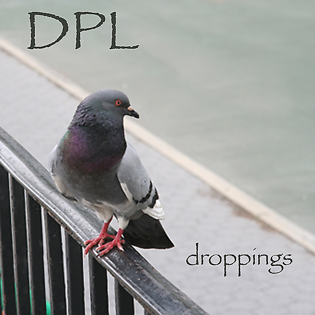
Camera Work/Technical: It's difficult to find your main focal point. It looks like your focus locked onto the rail instead of the preferred area of the pigeon's eye.
Lighting: Your lighting is pretty good, but maybe just a bit flat. I think a little curves adjustment would have helped out a good deal.
Composition/Content: I like your leading lines and your rule of thirds use. The eye is immediately drawn to the nice placement of the subject, while the rail, sidewalk and street lines all work well together to draw the eye around the frame.
My Opinion: Funny, but not quite what the voters were looking for. With a better placement of your focus and a little bit of a lighting adjustment, I think this would have placed a bit better.
Thank you for the opportunity to provide a critique on your entry,
Eric
|
|
Comments Made During the Challenge  |
|
|
05/18/2007 06:12:14 AM |
|
 Photographer found comment helpful. Photographer found comment helpful. |
|
|
05/16/2007 11:37:31 AM |
| Ha!! Love the band name, love the album title. Decent shot of the pigeon, too. |
|
| Photographer found comment helpful. |
|
|
05/14/2007 08:30:30 PM |
| Lol. very funny and very nice layout. Bump. |
|
| Photographer found comment helpful. |
|
|
05/14/2007 02:15:33 PM |
| fuzzy - the focus seems to be soft. |
|
| Photographer found comment helpful. |
|
|
05/14/2007 05:20:38 AM |
|
| Photographer found comment helpful. |
|
|
05/14/2007 03:05:57 AM |
|
| Photographer found comment helpful. |
Home -
Challenges -
Community -
League -
Photos -
Cameras -
Lenses -
Learn -
Help -
Terms of Use -
Privacy -
Top ^
DPChallenge, and website content and design, Copyright © 2001-2025 Challenging Technologies, LLC.
All digital photo copyrights belong to the photographers and may not be used without permission.
Current Server Time: 04/11/2025 07:21:25 PM EDT.