| Author | Thread |
Comments Made During the Challenge  |
|
|
05/20/2007 05:44:27 AM |
| Mmmm, nice puppy shot, however, I think it should have been a square crop... |
|
 Photographer found comment helpful. Photographer found comment helpful. |
|
|
05/18/2007 10:13:01 AM |
| wrong shape but donny osmand would love this......great pic though |
|
| Photographer found comment helpful. |
|
|
05/17/2007 05:54:28 AM |
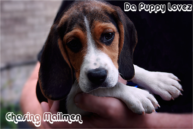
I love the font - great choice of style and size. The puppy is also very cute.
I'd slightly reposition the logo in the upper right corner. It's a little too close to the top and right hand edges. I'd also like to see a little more detail drawn out of the shadow on the puppies left eye. |
|
| Photographer found comment helpful. |
|
|
05/16/2007 03:23:03 PM |
| Lack of lighting on the left side of the dog's face has hidden some of the detail, and the composition also seems a bit off. Maybe you could have used a reflector to bring out more of the left side of the dog's face? |
|
| Photographer found comment helpful. |
|
|
05/16/2007 10:28:16 AM |
The only thing that instantly caught my eye is that the space between the text and the frame is uneven. Da Puppy Lovez probably shouldn't be that close to the frame.
Otherwise, it's a nice shot and really does well. |
|
| Photographer found comment helpful. |
|
|
05/16/2007 05:01:57 AM |
| Cute puppy! Love the album title, too. Probably would do a little better if it were formatted more as an album/CD cover (ie squarish). |
|
| Photographer found comment helpful. |
|
|
05/15/2007 06:54:07 AM |
| would've liked to see more puppy face 7 |
|
| Photographer found comment helpful. |
Home -
Challenges -
Community -
League -
Photos -
Cameras -
Lenses -
Learn -
Help -
Terms of Use -
Privacy -
Top ^
DPChallenge, and website content and design, Copyright © 2001-2025 Challenging Technologies, LLC.
All digital photo copyrights belong to the photographers and may not be used without permission.
Current Server Time: 04/08/2025 04:53:54 AM EDT.