| Author | Thread |
Comments Made During the Challenge  |
|
|
05/06/2007 05:17:11 PM |
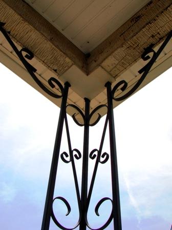
| i like it, but i would have cropped more off the top. The brown area of the roof takes away from the beautiful blue sky. |
|
|
|
05/06/2007 04:43:03 PM |
| There's not much imagination in this picture. Looks like you were desparate to get a photo into this contest. |
|
|
|
05/06/2007 06:56:41 AM |
| Symmetric but does not have a real point/story to tell. The composition with the post right in the middle also make the shot a bit boring. A different shooting angle would have jazzed it up a bit. |
|
|
|
05/05/2007 12:56:12 AM |
| I find it a shame that the post itself is slightly off-center.. 5 |
|
|
|
05/04/2007 12:35:59 PM |
| Better if the support structure were vertical. |
|
|
|
05/03/2007 09:33:12 PM |
| nice idea, though not very sharp on my screen. i also think that it would have been immediately more visually striking if it had actually been centered to be perfectly symetrical, where this seems off-center and just slightly unbalanced. |
|
Home -
Challenges -
Community -
League -
Photos -
Cameras -
Lenses -
Learn -
Help -
Terms of Use -
Privacy -
Top ^
DPChallenge, and website content and design, Copyright © 2001-2025 Challenging Technologies, LLC.
All digital photo copyrights belong to the photographers and may not be used without permission.
Current Server Time: 04/07/2025 01:32:42 PM EDT.