| Author | Thread |
|
|
05/12/2007 06:24:56 AM |
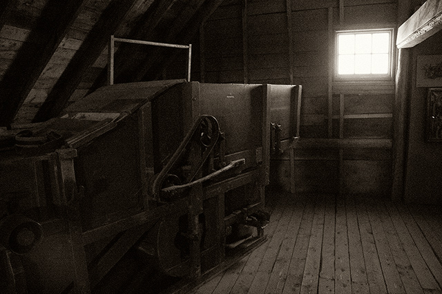
| it gives me the feel of a old house where you could go to find cool things. |
|
 Photographer found comment helpful. Photographer found comment helpful. |
|
|
05/04/2007 08:22:46 AM |
| Nice natural light and graininess. I like "quiet" images like this. |
|
| Photographer found comment helpful. |
|
|
05/03/2007 04:33:56 PM |
| That's too bad you were sick - hope you are feeling better now! I love the light coming thru the window. The color tones and grains give it that nice old-time feel. |
|
| Photographer found comment helpful. |
|
|
05/03/2007 06:14:06 AM |
| sorry you were sick, you done a great job captureing this. you can feel how old the thresher is in the shot |
|
| Photographer found comment helpful. |
|
|
05/02/2007 04:50:49 AM |
| I really like how the line of the machine leads up to the lighted window. Nice tones and grain. |
|
| Photographer found comment helpful. |
|
|
05/02/2007 04:48:37 AM |
| Christian, this is a neat shot. I thought this should have scored much higher. I love the old grainy feel to it. Nice job. |
|
| Photographer found comment helpful. |
|
|
05/02/2007 02:41:56 AM |
| Hmmm... how dare ye enter something where nothing is precisely on the crosshairs of the rule of thirds pattern thingie? :-) Like the grain and the abandonned feel of this. |
|
| Photographer found comment helpful. |
Comments Made During the Challenge  |
|
|
05/01/2007 03:28:24 PM |
| Nice toning, addition of gran and choice of tone, but boy does that thing look scary! |
|
| Photographer found comment helpful. |
|
|
04/30/2007 02:26:17 AM |
|
| Photographer found comment helpful. |
|
|
04/28/2007 12:40:11 PM |
| Cool shot. I don't see anything lining up in the four intersections though. It would have fit better with the window more towards the middle or upper right intersection. |
|
| Photographer found comment helpful. |
|
|
04/28/2007 06:38:25 AM |
| The window of course stands out and makes the "rule of thirds", though it's cropped a bit too much past the thirds. For me it's a little too dark inside and bright through the window, but perhaps that was the intent, to contrast this room with the world. |
|
| Photographer found comment helpful. |
|
|
04/26/2007 09:54:06 AM |
| Rule of thirds doesn't jump out at me in this one. Also, subject is dark and overwhelmed by the window...my eyes keep going to it. |
|
| Photographer found comment helpful. |
|
|
04/25/2007 06:20:00 PM |
|
| Photographer found comment helpful. |
Home -
Challenges -
Community -
League -
Photos -
Cameras -
Lenses -
Learn -
Help -
Terms of Use -
Privacy -
Top ^
DPChallenge, and website content and design, Copyright © 2001-2025 Challenging Technologies, LLC.
All digital photo copyrights belong to the photographers and may not be used without permission.
Current Server Time: 04/07/2025 01:28:52 PM EDT.