| Author | Thread |
|
|
05/17/2007 04:00:08 PM |
I gave you a 2 but only because I thought you might be some old guy with failing eye sight, who had just lost his wife of 60 years etc etc.
I agree with the centiment here but most of the comments were not helpfull, they just stated the obvious. |
|
|
|
05/01/2007 04:37:13 PM |
| Congrats on the brown! Sorry, I only gave you a 3, because I could still recognize what it was. |
|
|
|
04/30/2007 12:45:29 PM |
| The 10 was me....lol, I knew this was someone going for the brown and I am disappointed that no one else voted with me. |
|
|
|
04/30/2007 08:45:40 AM |
Thanks charliebaker, that was what I was going for and I can't believe that this many people got pissed about it.
For all the people who think I wasted everyone's time with this entry, get over it.
Now for my comments
- I have never received more than 22 comments on an entry until now and it was a crappy one. I know that during voting, people are reminded to comment on all votes lower than a 3 but come on people, I never got this kind of comments when I entered my first challenge and I was actually trying my best there.
- The 10 is definitively an anti-troll vote because I have no friends. I am just surprised that I did not get any 9's, 8's or 7's.
- How were there 10 people who thought this was a 5? A 5 suggests that this photo was average. NEWS FLASH, IT GOT LAST PLACE. It was not average it was terrible.
- More 4's than 2's? Ok I can see some people feeling guilty about voting below the 3 mark and not leaving a comment but come on folks, try to actually vote each entry for what it deserves. A 4 really means that an entry is a bit below average.
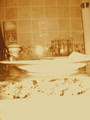
Anyhow. Next time you see an absolutely horrible entry, vote it appropriately. In my opinion, any entry less than 50% of the max entry size is generally a 4 or lower. Any entry this blurry, unless done for effect, is a 3 or lower. And any entry with this much wrong and even the title spelled wrong, deserves a 1 no matter who took it. |
|
|
|
04/30/2007 07:28:09 AM |
Great job on the brown! Small blurry photos will sink quickly. Titles that have missspelled words (knifes versus knives) add to the counter-weight. Since the SC added the "comment on all photos voted 3 or lower please" instruction box, people tend to vote higher, issuing fewer 1's. To score 1.8 on any challenge anymore would be amazing. You'd push yourself deeper into the basement if you had taken a photo of cleaning supplies rather than kitchen anything. DNMC always pushes people to knock off a point.
By the way, ignore the whiners who say you've wasted people's time on 37 comments (now 42). People comment on what they want to comment on, and really crappy brown entries tend to draw comments. We are drawn to what is superb and what is really bad.
I find brown entries very funny, and enjoy looking at them. Quirky sense of humor I suppose. Your entry cracks me up. Congrats on a well deserved brown. |
|
|
|
04/30/2007 04:31:52 AM |
Originally posted by Monique64:
Someone gave this a 10?? A friend voting?? |
An anti-troll! |
|
|
|
04/29/2007 10:11:12 PM |
| Someone gave this a 10?? A friend voting?? |
|
|
|
04/29/2007 10:08:03 PM |
| 37 comments? THIS is something SC needs to dig its teeth into. This infuriates me! Think of all those wasted comments, when those people could be helping others. its a bad bad thing.. |
|
|
|
04/29/2007 10:07:51 PM |
Why wouldyou "go for the brown"? you just took 30ish useful comments away from other users that have photos who actually needed the critique.
and also not to be rude, but how was that 10 counted? obviously it was a joke vote
Message edited by author 2007-04-30 02:08:34. |
|
|
|
04/29/2007 08:48:01 PM |
| You did it. Now you owe owe at least 5 comments to everyone whose time you wasted in commenting on this. |
|
Comments Made During the Challenge  |
|
|
04/29/2007 03:10:43 PM |
| Well, really oof, and the lighting is really lacking. Also color balance could use a change to make less orangy. Image size also causes another problem. |
|
|
|
04/29/2007 01:36:39 PM |
| Out of focus and too small |
|
|
|
04/29/2007 12:01:21 PM |
| Out of focus and too small. Good idea..just could have been composed better. |
|
|
|
04/29/2007 06:20:42 AM |
| out of focus, but I agree that's how mine look first thing in the AM especially after the bottle of chianti the night before |
|
|
|
04/29/2007 03:06:44 AM |
| To small and out of focus... |
|
|
|
04/28/2007 05:25:10 PM |
| Indeed, the most basic of kitchenware - so you started on the right track. A tighter crop on the forks, knives and spoons would help this entry. Also the photo is tilted to the left a bit. And finally - focus needs some work. I can imagine you might have been pressed for time to get an entry in on time...I am guilty of that - let's promise to slow our selves down! I bet we get better scores soon! It's not a bad photo, but it's good either - hope you can settle for a 5 |
|
|
|
04/28/2007 03:26:41 PM |
| Too small and too out of focus. |
|
|
|
04/28/2007 05:17:21 AM |
| too small..but I bet you have gotten that comment already |
|
|
|
04/27/2007 08:35:51 AM |
| Was this taken using a cell phone camera or something? Not worthy of any contest I would say. Bad lighting, wrong colors, completely out of focus, blurred.... What the ....? |
|
 Photographer found comment helpful. Photographer found comment helpful. |
|
|
04/27/2007 06:56:04 AM |
| I'm sorry but this just does nothing for me. |
|
|
|
04/27/2007 06:37:34 AM |
|
| Photographer found comment helpful. |
|
|
04/26/2007 04:34:24 PM |
| Out of focus. I see more than just Forks, Knifes and Spoons |
|
|
|
04/26/2007 04:24:22 PM |
| too small, blurry, white balance way off, boring subject. 1 |
|
| Photographer found comment helpful. |
|
|
04/26/2007 01:24:22 PM |
| Perhaps a more unique perspective and either clear focus or reason for motion blur would improve this. |
|
| Photographer found comment helpful. |
|
|
04/25/2007 08:08:21 PM |
|
|
|
04/25/2007 06:48:36 AM |
| the shot looks a little shaky, have you thought of some sort of camera support, also the picture is small |
|
| Photographer found comment helpful. |
|
|
04/25/2007 06:45:53 AM |
| this looks like a problem with hand shake, I would sugest useing a trypod or a solid surface to suport your camara. Also the lighting looks a bit too low, did you use a flash? |
|
| Photographer found comment helpful. |
|
|
04/25/2007 03:17:05 AM |
| It is blurry and there is no contrast. Colors are off too. |
|
| Photographer found comment helpful. |
|
|
04/24/2007 06:53:20 PM |
| too small and out of focus |
|
| Photographer found comment helpful. |
|
|
04/24/2007 05:06:44 PM |
| image seems out of focus and too small |
|
| Photographer found comment helpful. |
|
|
04/24/2007 12:00:15 PM |
| Seems to have the color and tilt of a whiterook shot? |
|
| Photographer found comment helpful. |
|
|
04/24/2007 11:39:06 AM |
Deleting "helpful" comment. If going for the brown why bother.
Message edited by author 2007-04-30 17:14:03. |
|
| Photographer found comment helpful. |
|
|
04/24/2007 10:16:20 AM |
| poor image size, not in focus, needs a more interesting composition |
|
| Photographer found comment helpful. |
|
|
04/24/2007 08:27:39 AM |
| well, you know by now: too small, too blurry, wrong WB,no composition |
|
| Photographer found comment helpful. |
|
|
04/24/2007 05:14:52 AM |
LOLLLLLLLLLLLL
i hope its serious LOLLLLLLLLLLLLLL |
|
| Photographer found comment helpful. |
|
|
04/23/2007 03:48:59 PM |
| a little out of focus, but you were probably going for that effect. |
|
| Photographer found comment helpful. |
|
|
04/23/2007 01:21:36 PM |
| Bigger and in-focus would be better |
|
| Photographer found comment helpful. |
|
|
04/23/2007 09:44:27 AM |
| check out how to size for challenges, you'll find your score will greatly improve with the proper size |
|
| Photographer found comment helpful. |
|
|
04/23/2007 09:39:37 AM |
|
|
|
04/23/2007 08:49:50 AM |
| Need to work on the focus (maybe too long of a shutter speed?). Color balance is wrong also. |
|
| Photographer found comment helpful. |
|
|
04/23/2007 08:00:15 AM |
To my eye, this is a bit over exposed, with poor color balance, orientation and resolution. I am wondering if it was taken with a camera phone?
Suggest reading the tutorial regardng preparing a photo for DPC Challenges. I think it will help you present the best your images have to offer. |
|
| Photographer found comment helpful. |
|
|
04/23/2007 05:15:09 AM |
|
| Photographer found comment helpful. |
|
|
04/23/2007 03:23:07 AM |
| lighting is very yellowish - quite out of focus and not interesting image 1 |
|
| Photographer found comment helpful. |
|
|
04/22/2007 08:59:59 PM |
| Too small, blurry and dim. |
|
| Photographer found comment helpful. |
|
|
04/22/2007 08:36:10 PM |
| Looks way too blurry to me. |
|
| Photographer found comment helpful. |
|
|
04/22/2007 08:11:53 PM |
| Sorry, pretty out of focus. 4 |
|
Home -
Challenges -
Community -
League -
Photos -
Cameras -
Lenses -
Learn -
Help -
Terms of Use -
Privacy -
Top ^
DPChallenge, and website content and design, Copyright © 2001-2025 Challenging Technologies, LLC.
All digital photo copyrights belong to the photographers and may not be used without permission.
Current Server Time: 04/07/2025 01:32:41 PM EDT.