| Author | Thread |
|
|
04/30/2007 02:08:51 PM |
hi
Message edited by author 2007-06-14 13:26:15. |
|
 Photographer found comment helpful. Photographer found comment helpful. |
|
|
04/30/2007 02:53:13 AM |
| I know this photo did not do very well but I just know that my picture in the bubbles challenge will do better!! |
|
Comments Made During the Challenge  |
|
|
04/29/2007 06:03:24 AM |
| Nice concept, but rate 3 becasue of glare from flash |
|
| Photographer found comment helpful. |
|
|
04/27/2007 06:42:50 AM |
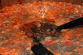
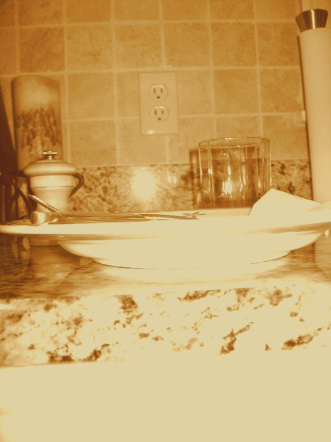
I cannot believe this actually got submitted.
Uninteresting color
Blown out
Flash flare on the wall
Out of focus
Horizon tilted
Wall plug is distracting
and the list goes on...
It looks like you just did a quick snapshot because you didn't have a better idea and submitted "just to submit". |
|
| Photographer found comment helpful. |
|
|
04/26/2007 04:09:23 PM |
| OK, not sure what you are trying to achieve here, but its VERY over-exposed, uninteresting composition and the sepia effect doesnt really add anything to the image. I'm sorry but not a very good effort. Take more time to study the image through your viewfinder and decide if it is pleasing to look at. 2 |
|
| Photographer found comment helpful. |
|
|
04/26/2007 01:39:06 PM |
| Lighting is rather harsh. |
|
| Photographer found comment helpful. |
|
|
04/25/2007 08:57:17 AM |
| sorry, I do not like saying this but I have to be honest or not give a comment at all and I am still not sure what is worse.but this shot IMO is not level has poor exposure is dull in colour and contrast. |
|
| Photographer found comment helpful. |
|
|
04/25/2007 03:14:35 AM |
| Overexposed on the bottom of the bowl, and the monotone does not add anything to the image. |
|
| Photographer found comment helpful. |
|
|
04/24/2007 06:53:56 PM |
| exposure and toning are very harsh; composition and tilt are awkward |
|
| Photographer found comment helpful. |
|
|
04/24/2007 04:39:38 PM |
| This is not a style that appeals to me. I'm guessing this was obtained on purpose? |
|
| Photographer found comment helpful. |
|
|
04/24/2007 11:50:34 AM |
Hmmmm... Are you going for the brown ribbon???? :))
Its tilted the left. The exposure on the front of the plate is blown out. And overall, its not very clear. |
|
| Photographer found comment helpful. |
|
|
04/24/2007 10:12:20 AM |
| a bit overexposed...not the best color or composition |
|
| Photographer found comment helpful. |
|
|
04/23/2007 05:01:26 PM |
| I suspect this is a whiterook image. How should I vote to stay out of trouble? |
|
| Photographer found comment helpful. |
|
|
04/23/2007 03:19:25 PM |
| oh dear oh dear oh dear... |
|
| Photographer found comment helpful. |
|
|
04/23/2007 11:33:48 AM |
| way too bright ... horizon tilted to the left |
|
| Photographer found comment helpful. |
|
|
04/23/2007 09:21:27 AM |
|
| Photographer found comment helpful. |
|
|
04/23/2007 07:58:58 AM |
To my eye, this is over exposed, with poor color balance, orientation and resolution. I am wondering if it was taken with a camera phone?
Suggest reading the tutorial regardng preparing a photo for DPC Challenges. I think it will help you present the best your images have to offer. |
|
| Photographer found comment helpful. |
|
|
04/23/2007 07:21:24 AM |
| I think a different angle would work better with this picture. Also, the lighting is a bit harsh (I've found that the built-in flashes hardly ever work best...try using a totally separate light source set at a different angle). |
|
| Photographer found comment helpful. |
|
|
04/22/2007 08:16:07 PM |
|
| Photographer found comment helpful. |
Home -
Challenges -
Community -
League -
Photos -
Cameras -
Lenses -
Learn -
Help -
Terms of Use -
Privacy -
Top ^
DPChallenge, and website content and design, Copyright © 2001-2025 Challenging Technologies, LLC.
All digital photo copyrights belong to the photographers and may not be used without permission.
Current Server Time: 04/07/2025 01:31:58 PM EDT.