| Author | Thread |
|
|
11/27/2003 03:25:24 PM |
Hello from the Critique Club!
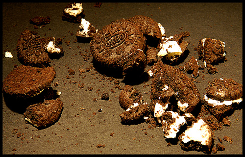
Splendid image! Fits the challenge perfectly and works well on its own. I especially enjoy the contrasts and the textures shown. There are a few areas that I think could use some work though, so let's get cracking:
First lighting: I like the lighting here, I think the position is good, however something to either diffuse the light or alternative positioning may have helped combat the overexposure of the creamy goodness, while still allowing for the nice spotlight-ish effect currently in the photo.
Composition is great. I really like how the cookie crumbling turned out, the random placement of the cookie pieces gives it a very natural look, avoiding the stiff blockiness that a setup shot might have. Granted, if you did arrange the pieces specifically, extra kudos to you - you got it to look perfectly natural.
The contrasts are what really bring my eye in and keep me interested. The obvious being the dark color of the cookie and background against the light of the cookie creme. This type of image always has a nice punch to it, and this one is no exception. I think the lighter black tone of the background gives another contrast element and adds to the image.
A more subtle contrast that I am really enjoying is that of the textures shown with the two main ingredients: The brittle, gravel-like texture of the cookie vs the soft, smooth, creamy nature of the filling. Both are evident in the photo - though with the overexposure of the filling some of that is lost - were it toned down a bit I think that would show to greater effect.
Finally, my main issue with the photo aside from the blown out white, is the focus. Other commenters have mentioned it as well, and I have to agree. With an image like this, having such contrasts and textures available, a nice crisp focus would really make the photo pop and give it a bit more depth. I think this aspect is even more crucial than the overexposure because it blankets the whole image, whereas the whites are only a part of the image - though a noticeable one.
Very nice idea, well executed though some improvements could be made. Well done. |
|
 Photographer found comment helpful. Photographer found comment helpful. |
Comments Made During the Challenge  |
|
|
11/23/2003 11:58:50 AM |
| Very nice idea. I like the contrasts. It looks a little overly sharpened though. |
|
| Photographer found comment helpful. |
|
|
11/19/2003 05:47:56 PM |
| This shot is so interesting. The white lardy parts of the cookie look like fire. the lighting looks like a shot from a surveillance helicopter into someones back yard. I love it. |
|
| Photographer found comment helpful. |
|
|
11/19/2003 03:04:21 PM |
| A good idea, but the execution could use some more work. Image seems out of focus and the cookie cream in the lower right-hand corner is blown out (too bright). This might have been avoided by repositioning your light source to a different angle. |
|
| Photographer found comment helpful. |
|
|
11/19/2003 09:24:04 AM |
| not a bad idea but the quality is lacking.. nice lighting. a little overexposed maybe.. but the biggest problem is that it isn't clear.. low res or lower end cam maybe?? |
|
| Photographer found comment helpful. |
|
|
11/18/2003 11:38:06 AM |
Very imaginative, and a good literalistic interpretation of the phrase. Photographically, this isn't clear for some reason. Also, the white part of the cookie is overexposed. If your camera or software support's histograms, that's a good way to watch for these things. Look for an exposure where the histogram approaches but does not quite reach the right exposure limit.
Supplementary information exchanged via email in response to the authors query (put here with the picture for the benefit of others):
----------------------------------------------------------
It' s hard for me to tell why your photo doesnt look clear from the small
photo, but here's some theories:
1) It may be noise. Long exposures on most digital cameras result in a
noisy image, much like using high ISO values. Or if you were set to a high
ISO value, or used automatic exposure where the camera can vary the ISO
value for greater sensitivity, that would introduce noise.
2) It may be oversharpened. That cause contrast halos to appear, which can
actually make a photo less clear. Especially one with a lot of detail or
some noise to begin with.
3) It could be the result of JPEG artifacts, from using too high a
compression ratio (or as the setting often goes, too low a quality setting).
I can't tell because its small; I see something that looks like a block
effect on the table, but it also could be a texture or pattern.
No, I don't think the overexposed regions is why it's unclear, but the long
exposure could have something to do with it if the floor, room, or tripod
vibrated at all, even ever so slightly. For example, if its on a tripod, on
a wood or plywood based floor, and someone trodded by, there could by a
slight vibration which could cause lack of clarity.
As far as the histogram article, my G2 makes it really easy to spot
overexposed areas when using the histogram function. You see there are
overexposed areas in the thumbnail, and it goes a step further and flashes
the overexposed regions in the thumbnail. I don't know if your S20 supports
that. My son has an A60, and it doesn't have this function.
Here's an article online that might be some help.
//www.luminous-landscape.com/tutorials/understanding-series/understanding-histograms.shtml
I also recommend Scott Kelby's series, The Photoshop Book for Digital
Photographers, and the equivalent one for Elements (which is what I have.)
|
|
| Photographer found comment helpful. |
|
|
11/18/2003 04:16:13 AM |
|
| Photographer found comment helpful. |
|
|
11/17/2003 03:22:28 PM |
| So sad! Nice choice of oreos - the white and dark brown contrast well. Wish the backgrouns were black, black black, and crumbs and all sharper. |
|
| Photographer found comment helpful. |
|
|
11/16/2003 08:44:56 PM |
| Heehee, good idea. I like this although the it's out of focus. |
|
| Photographer found comment helpful. |
|
|
11/16/2003 07:33:36 PM |
| Mmmm. Oreos. Fun title matches your photo. Lighting is quite nice. Good idea! |
|
| Photographer found comment helpful. |
Home -
Challenges -
Community -
League -
Photos -
Cameras -
Lenses -
Learn -
Help -
Terms of Use -
Privacy -
Top ^
DPChallenge, and website content and design, Copyright © 2001-2025 Challenging Technologies, LLC.
All digital photo copyrights belong to the photographers and may not be used without permission.
Current Server Time: 04/07/2025 01:06:30 PM EDT.