| Author | Thread |
Comments Made During the Challenge  |
|
|
02/17/2007 02:49:17 AM |
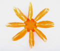
| fowers just die anyway, well done |
|
|
|
02/15/2007 12:30:03 PM |
|
|
|
02/15/2007 10:10:28 AM |
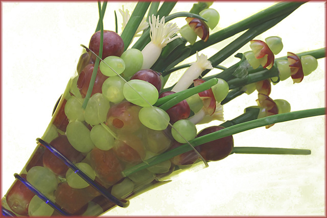
| Nice arrangement and compostion. Border works well. Not sure if something slipped through in editing, but the background looks uneven, especially lower right corner. |
|
 Photographer found comment helpful. Photographer found comment helpful. |
|
|
02/14/2007 01:28:41 AM |
| i like the angle and the work you put into it. the colours are a bit pale though. |
|
| Photographer found comment helpful. |
|
|
02/13/2007 08:28:19 AM |
| Excellent and creative job! |
|
| Photographer found comment helpful. |
|
|
02/13/2007 08:21:16 AM |
| beautiful, creative arrangment, but there is something on the canvas in the lower right hand corner! |
|
| Photographer found comment helpful. |
|
|
02/12/2007 09:33:44 AM |
| colors seem a bit washed out ... maybe a boost of saturation would help this ... |
|
| Photographer found comment helpful. |
|
|
02/12/2007 09:30:25 AM |
| Very nicely setup. Lots of work involved in this and beautifully done. Great color and nice angle. |
|
| Photographer found comment helpful. |
|
|
02/12/2007 07:39:37 AM |
| It really looks like you've done a bunch of cloning in the background, but I could be wrong. The point is that it LOOKS like you have, and that's bad. Cloning would be fine, but I bet you've got one of those bright new LCD monitors that sometimes make shots (especially cloning edits) look really good and smooth, but on normal monitors, there's a bunch of marks and dark areas, etc. Best of luck. This is a really nice shot, but it's a fraz dark. |
|
| Photographer found comment helpful. |
|
|
02/12/2007 06:45:45 AM |
| I like your arrangement. IMO the even and big light source from above makes the colors apear a little washed out. I copied your picture into PS and played just slightly with curves (a typial S-curve). Amazing, what happened to your great picture. |
|
| Photographer found comment helpful. |
|
|
02/12/2007 06:01:56 AM |
| lighting is a little flat. |
|
| Photographer found comment helpful. |
|
|
02/12/2007 01:18:27 AM |
| This seems washed out to me. Could be sharper and have more contrast. |
|
| Photographer found comment helpful. |
|
|
02/11/2007 08:51:23 PM |
| Great idea and composition. Needs a touch more "umph". Yellow in the bottom right is very distracting. |
|
| Photographer found comment helpful. |
Home -
Challenges -
Community -
League -
Photos -
Cameras -
Lenses -
Learn -
Help -
Terms of Use -
Privacy -
Top ^
DPChallenge, and website content and design, Copyright © 2001-2025 Challenging Technologies, LLC.
All digital photo copyrights belong to the photographers and may not be used without permission.
Current Server Time: 04/07/2025 12:36:56 AM EDT.