| Author | Thread |
|
|
08/19/2002 01:35:00 AM |
| ugh... underrated IMHO... i loved this photo... :) |
|
Comments Made During the Challenge  |
|
|
08/18/2002 06:45:00 PM |
| Nice macro. I still have not figured out what it is. |
|
|
|
08/18/2002 04:47:00 PM |
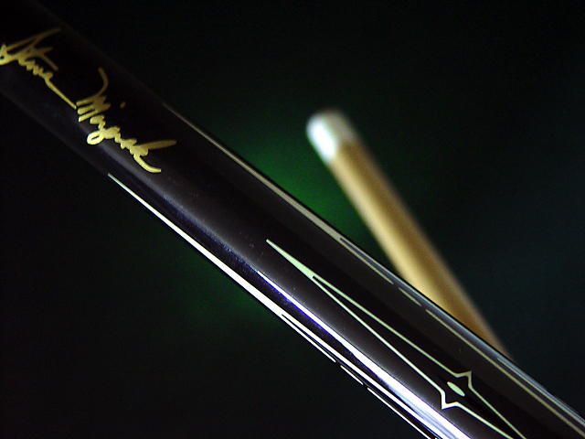
| Somehow I get the feeling I am missing the point here. It's a nice image though. A bit mysterious. I don't know what "The Miz" is. I feel rather dumb. I see how the pen is newer than a pencil...funny that pencil is this week's challenge. You already have the practice!...LOL |
|
|
|
08/18/2002 02:21:00 PM |
| Good pic, but the tan object in the background is distracting to me. |
|
|
|
08/18/2002 10:21:00 AM |
| Excellent background and arrangement. I dont understand your title but that matters not at all. Really excellent work - well done. 9 from me. |
|
|
|
08/17/2002 01:31:00 PM |
| I'm hearing the movie now... "I didn't deserve that...." from the 'color of money' :) Great shot... the lighting is excellent and the effective use of depth of field works really well here... I hope the rest of the voters understand what you have presented here... good shot :) = 9 - jmsetzler |
|
|
|
08/16/2002 10:56:00 AM |
| Sometimes I can be totally oblivious to the obvious. At first, I thought this was a match and some kind of cigarette case, or cigar case. Then, only after staring at this forever, I realized that it is a pool stick. Here is the irony of this. I love pool, play it all the time and as a matter of fact have my own pool room in the basement of my house. The fact that I love the game, does not really mean that I know anything about the history of pool, therefor the reference to the signiture in the title didn't hit me. I think that maybe someone that doesn't know anything at all about the game may not be able to identify it. But, since I can, I'll let you know that I love how you put the green in the background to symbolize the felt table. That was very clever. I know you did it on purpose, making the tip fuzzy like that, but if it were maybe just a little bit clearer the slow people (me) could identify it a bit quicker. I'm just afraid someone is just going to glance at it, say "don't know what this it" rate it low and go on. I'm personally giving it a higher rating. Great job and good luck in the challenge. |
|
|
|
08/15/2002 08:52:00 PM |
|
|
|
08/15/2002 04:33:00 PM |
| Very well composed. Reflective ligting bloomed a little. Maybe underexpose this one, and then change the lighting curve to bring the highlight back out without bloom. Also maybe one stop higher to get the snap back in the Mizerak name. |
|
|
|
08/15/2002 03:34:00 PM |
| New pool cue? I am pretty conflicted for this shot. I like seeing the upper end of the cue, not certain if I like or don't like the off in the distance part, let's call that photog's choice. Probably should suggest you re-look at the signature for both cropping and lighting. The hint of green in the middle quietly suggests pool table (nice touch), but might be better were it to appear on both sides. 7 Swash |
|
|
|
08/15/2002 08:49:00 AM |
| Great shot – but the theme is weak… |
|
|
|
08/15/2002 06:11:00 AM |
|
|
|
08/14/2002 08:52:00 PM |
| Not sure how this connects with the challenge. It is certainly a good example using aperture to adjust the depth of field |
|
|
|
08/14/2002 04:47:00 PM |
|
|
|
08/13/2002 11:12:00 PM |
Something new.
Composition - quite good
Technical Aspects - quite good.
Meets Challenge - I don't know. I'll assume so
Visual Impact / Originality – pretty good
Jim msp
|
|
|
|
08/13/2002 08:54:00 PM |
Composition5
Technical Aspects5
Appeal4
Creativity5
Rating5Autool
|
|
|
|
08/12/2002 11:33:00 PM |
| nice background, framing, lighting. |
|
Home -
Challenges -
Community -
League -
Photos -
Cameras -
Lenses -
Learn -
Help -
Terms of Use -
Privacy -
Top ^
DPChallenge, and website content and design, Copyright © 2001-2026 Challenging Technologies, LLC.
All digital photo copyrights belong to the photographers and may not be used without permission.
Current Server Time: 02/01/2026 06:56:27 AM EST.