| Author | Thread |
Comments Made During the Challenge  |
|
|
08/18/2002 07:27:00 AM |
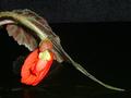
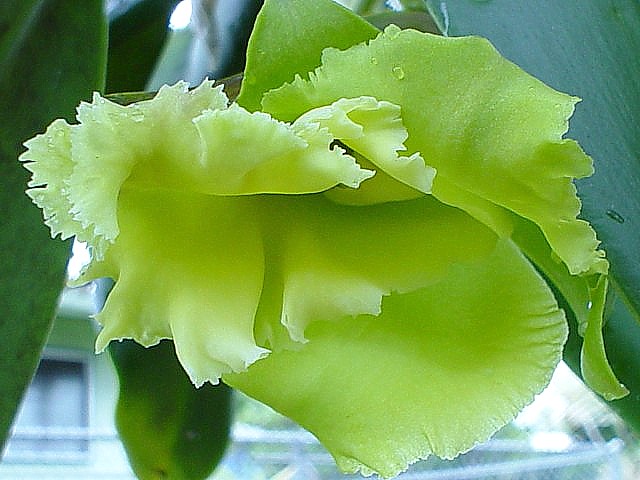
| This is pretty neat. I like the close up, and the lighting is great. WIsh we could see something done about the background. Maybe, since the majority of the photo is green, you could put some green leaves, like on a branch or something behind the flower to make the background flow and make it all the same. Just something to hide the house and fence. I like the placement of the flower in the photo. Nice job and good luck with the challenge. |
|
|
|
08/17/2002 12:12:00 PM |
| Good subject. A bit overexposed, and white balance is off for an outdoor shot. Adjust blue and green channels accordingly. |
|
|
|
08/15/2002 03:20:00 PM |
| I don't like to see the name of the challenge (new) used in the title... too cliche or something. There are lots of other, more creative ways to express it. Lots of flowers in this challenge, and your is one of the best ones. What an interesting color. Good light, good focus. |
|
|
|
08/15/2002 07:42:00 AM |
|
|
|
08/14/2002 04:55:00 PM |
| I suppose it meets the challenge but I do not think this appeals to a broad audience we have on DPC. For example, I personally cannot make a connection by looking at the image primarily because I do not know the difference between a new orchid vs. an old orchid...Maybe they look the same..I don't know. |
|
|
|
08/14/2002 05:27:00 AM |
|
|
|
08/13/2002 02:30:00 PM |
Something new.
Composition - quite good
Technical Aspects - quite good
Meets Challenge - yes
Visual Impact / Originality � quite good
Jim msp
|
|
|
|
08/13/2002 08:45:00 AM |
| This is a good photograph, but it's just not inspiring to me. This photo may have more impact if there was a dark or solid background behind it :) - jmsetzler |
|
|
|
08/12/2002 08:13:00 PM |
| The monochromatic colors are lovely and the curvy shapes seem so smooth. But the background is a bit distracting. |
|
|
|
08/12/2002 05:49:00 PM |
| I like your subject and the various green tones but the building and fence (?) in the back are very distracting. I would've either completely blurred them or re-arranged the composition/ angle so they wouldn't be in the shot. |
|
|
|
08/12/2002 04:55:00 PM |
Composition8
Technical Aspects6
Appeal8
Creativity6
Rating7Autool
|
|
|
|
08/12/2002 02:46:00 PM |
| Color is washed out, but great shot. |
|
|
|
08/12/2002 04:26:00 AM |
| Good idea. Photo quality not so good. |
|
|
|
08/11/2002 08:47:00 PM |
|
Home -
Challenges -
Community -
League -
Photos -
Cameras -
Lenses -
Learn -
Help -
Terms of Use -
Privacy -
Top ^
DPChallenge, and website content and design, Copyright © 2001-2025 Challenging Technologies, LLC.
All digital photo copyrights belong to the photographers and may not be used without permission.
Current Server Time: 04/06/2025 10:32:38 PM EDT.