| Author | Thread |
|
|
11/28/2006 08:44:56 AM |
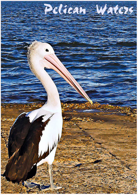
| This would make the perfect Post Card Shezzie!! |
|
 Photographer found comment helpful. Photographer found comment helpful. |
|
|
11/27/2006 08:55:07 AM |
| Shez, I think that it should have a small note on the back of this post card informing all visitors to wear a wide brimmed hat :) |
|
| Photographer found comment helpful. |
|
|
11/27/2006 03:23:24 AM |
| Hi Shez, this would make a very good postcard. |
|
| Photographer found comment helpful. |
|
|
11/27/2006 01:40:48 AM |
| I just like to say, I think I rushed this one, and let my heart override my brain. I now realize that I have overprocessed this postcard, so thank you for your support and comments. |
|
|
|
11/27/2006 01:27:13 AM |
| This would make an excellent postcard. |
|
| Photographer found comment helpful. |
Comments Made During the Challenge  |
|
|
11/26/2006 06:56:25 PM |
| The pelican is overexposed |
|
| Photographer found comment helpful. |
|
|
11/25/2006 04:58:59 PM |
| That is a terrifice shot! |
|
| Photographer found comment helpful. |
|
|
11/22/2006 12:23:06 AM |
| A bit over exposed but well composed. |
|
| Photographer found comment helpful. |
|
|
11/21/2006 11:24:07 AM |
| The pelican is alright as a subject. Looks like some detail has been lost in the white areas of the bird either from overexposing or pushing the contrast too high perhaps. The pelican seems to be in focus just fine, but the photo overall seems oversharpened. Positioning of your subject within the frame is good. The text message is "ok". All JMO of course. :D Good luck in the challenge. |
|
| Photographer found comment helpful. |
|
|
11/20/2006 10:43:49 PM |
| very wierd looking picture. Has a very plastic quality to it. Too much contrast adjustment maybe? |
|
| Photographer found comment helpful. |
|
|
11/20/2006 10:15:46 PM |
| A little too bright on the feathers. |
|
| Photographer found comment helpful. |
|
|
11/20/2006 05:29:58 PM |
| Something about the saturation and/or colors doesn't look quite right. |
|
| Photographer found comment helpful. |
|
|
11/20/2006 05:11:18 PM |
| way, way oversharpened. the pelican is glowing! |
|
| Photographer found comment helpful. |
|
|
11/20/2006 11:18:43 AM |
| This picture would be more appealing if the detail of the white feathers had not been blown out. Remember to darken the exposure when shooting white in intense light. The details in the dark areas can always be restored in post processing. Also, the water seems over sharpened, which causes it to compete with the bird. |
|
| Photographer found comment helpful. |
|
|
11/20/2006 04:27:50 AM |
| A nice idea for a postcard, but something isn't quite right with the photo - contrast too high, and overly bright. The whites on the pelican are also over-exposed which detracts from the overall impression. On the plus side, nicely composed. |
|
| Photographer found comment helpful. |
|
|
11/20/2006 02:09:57 AM |
| Real postcard look, colors good...best of luck.... |
|
| Photographer found comment helpful. |
Home -
Challenges -
Community -
League -
Photos -
Cameras -
Lenses -
Learn -
Help -
Terms of Use -
Privacy -
Top ^
DPChallenge, and website content and design, Copyright © 2001-2026 Challenging Technologies, LLC.
All digital photo copyrights belong to the photographers and may not be used without permission.
Current Server Time: 02/01/2026 11:02:17 AM EST.