| Author | Thread |
|
|
11/29/2006 04:31:38 AM |
Hello from the Critique Club,
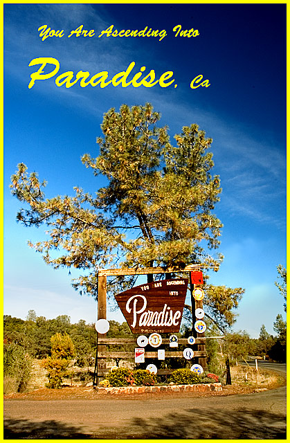
This image definitely meets the challenge and you received a lot of feedback on this image (some if it contradictory). With over 40% of your votes being 5's, that to me indicates that people looked for literally 2-3 seconds and concluded, "this picture isn't bad (so I can't give 4 or less), but it doesn't do too much for me (so I can't give 6 or more). The compositional centering of the sign gives a snapshot kind of feel to the image and lacks the wow factor required for a 6+ score at DPC. Compounding that is that the yellow border and letters make the colors in the foliage look a little washed out. I'm betting that this area of California looks a lot more attractive in the spring and summer when the plants are a dark green and the sky is blue. The timing of this challenge worked against you.
Feel free to PM me if you have any questions regarding this critique.
Tim
|
|
 Photographer found comment helpful. Photographer found comment helpful. |
Comments Made During the Challenge  |
|
|
11/26/2006 05:43:04 PM |
| Nice picture but ruined by the yellow border and yellow fonts. Also, repeating the word "Paradise" in the Postcard title seems not appropriate. |
|
| Photographer found comment helpful. |
|
|
11/25/2006 02:43:40 PM |
| this is bright and crisp, nice shot. |
|
| Photographer found comment helpful. |
|
|
11/25/2006 01:41:21 AM |
| I think the yellow is going to hurt you a bit here. Possibly the same setup with border and text would work better with white. Also it appears that the image, at least the sign with all its small signs in the vicinity, is over sharpened. I think the shot meets the challenge quite well, but might get an even better reaction if it were not so centered. This would give it a more dynamic feeling. This is all just my opinion - lord knows, I'm no expert. Hope you don't mind all this input on your image. I think Paradise, Ca looks like a lovely place to visit. |
|
| Photographer found comment helpful. |
|
|
11/23/2006 01:53:13 AM |
| Could be more in focus. Very nice colors in the sky. |
|
| Photographer found comment helpful. |
|
|
11/22/2006 10:58:59 AM |
| Very funny. Look like anything but paradise with that cluttered sign. |
|
| Photographer found comment helpful. |
|
|
11/21/2006 05:42:57 PM |
| everything about this "postcard" fits together. The yellow board really holds everything together. It has a kind of 1950s look to it. The highlights on the signs slipped away from you a little bit. |
|
| Photographer found comment helpful. |
|
|
11/20/2006 05:40:44 PM |
| I think this would have worked better with a close-up (or much sharper dipiction) of the sign. And no text. |
|
| Photographer found comment helpful. |
|
|
11/19/2006 11:40:28 PM |
| hey, I just drove through there yesterday. |
|
| Photographer found comment helpful. |
|
|
11/19/2006 11:14:09 PM |
|
| Photographer found comment helpful. |
Home -
Challenges -
Community -
League -
Photos -
Cameras -
Lenses -
Learn -
Help -
Terms of Use -
Privacy -
Top ^
DPChallenge, and website content and design, Copyright © 2001-2025 Challenging Technologies, LLC.
All digital photo copyrights belong to the photographers and may not be used without permission.
Current Server Time: 04/07/2025 01:47:39 PM EDT.