| Author | Thread |
|
|
01/29/2007 07:56:44 AM |
Originally posted by SuperTimmy:
I like how the photo is not level. Excellent post processing with the text added to the photo. Only suggestion, use brown text instead of blue to "match" the color of the grass in the foreground. |
Thanks SuperTimmy |
|
|
|
01/26/2007 02:57:51 AM |
| I like how the photo is not level. Excellent post processing with the text added to the photo. Only suggestion, use brown text instead of blue to "match" the color of the grass in the foreground. |
|
 Photographer found comment helpful. Photographer found comment helpful. |
|
|
11/28/2006 06:27:31 AM |
Originally posted by bood:
man you are the KING!
Three last places in a row.
genius |
Thanks, what s the odd? |
|
|
|
11/27/2006 06:04:09 AM |
man you are the KING!
Three last places in a row.
genius |
|
| Photographer found comment helpful. |
Comments Made During the Challenge  |
|
|
11/26/2006 08:00:22 PM |
| I really try not to be negative in my comments at all.. But, a snapshot like this really does not need to be here. I feel as if you were just trying to enter something, just to enter. Next time please try harder. |
|
| Photographer found comment helpful. |
|
|
11/26/2006 06:42:09 PM |
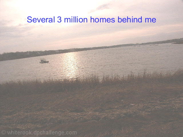
I am sure you have already been told that the horrizon is leaning!
I can see what you were trying with this shot but i'm not sure that the muted colours work.
Good luck anyway
Kev |
|
| Photographer found comment helpful. |
|
|
11/26/2006 05:49:08 AM |
| I must be missing the bigger picture here |
|
| Photographer found comment helpful. |
|
|
11/26/2006 12:11:07 AM |
| To whitewashed, I feel the need to squint. Then the blue text is way overbearing. IMO of course. |
|
| Photographer found comment helpful. |
|
|
11/25/2006 10:25:23 PM |
| I wish the horizon line was straight |
|
| Photographer found comment helpful. |
|
|
11/25/2006 05:19:00 PM |
|
| Photographer found comment helpful. |
|
|
11/24/2006 11:55:52 PM |
| Sorry, but this picture is too grainy, lacking in contrast, and focus. Are the homes behind the lake or flooded out, I can't tell what you are trying to say. I can't see the homes. |
|
| Photographer found comment helpful. |
|
|
11/24/2006 03:44:31 PM |
| Probably should say "million dollar" but great sentiment. Not sure I'm fond of the washed out look, though. |
|
| Photographer found comment helpful. |
|
|
11/23/2006 12:48:19 PM |
| Text and image are confusing. Not sure why I would pick this and send to someone |
|
| Photographer found comment helpful. |
|
|
11/22/2006 09:02:39 PM |
| This photo is lacking in contrast and depth. |
|
| Photographer found comment helpful. |
|
|
11/22/2006 07:04:54 PM |
| Sorry I don't care for this at all. The whole thing is washed out and the horizon is badly tilted. Perhaps these things were deliberate, but why? |
|
| Photographer found comment helpful. |
|
|
11/22/2006 04:53:15 PM |
ok, you have probably heard this already but here goes..
looks foggy, upping the contrast would help here. The image is wonky. The text is awful.. unless you are intentionally going for the brown ribbon here then I am afraid to say this will score quite poorly.. |
|
| Photographer found comment helpful. |
|
|
11/22/2006 10:36:18 AM |
| sorry but this is not working for me. the words don't' make much sense and the photo is tilted and grainy. |
|
| Photographer found comment helpful. |
|
|
11/22/2006 07:29:55 AM |
| I think this would have been a good shot had it not been faded and crooked. |
|
| Photographer found comment helpful. |
|
|
11/21/2006 09:59:34 PM |
| Well, I'm not sure what you were going for here, but the tilted horizon, foggy effect and weak use of text aren't coming together well for me, I'm afraid. |
|
| Photographer found comment helpful. |
|
|
11/21/2006 09:23:56 PM |
| the composition, text, font and angle of the crop really are over the top |
|
| Photographer found comment helpful. |
|
|
11/21/2006 09:20:45 PM |
| I'm not sure I get this one... photographically, the shot is unappealing and seems hazy with a tilted horizon. As far as the postcard part of the challenge, I don't get the added text, and the font and color choices don't seem to go well with the postcard. Even a few simple fixes like a levels adjustment, rotation and a different font could have been very helpful for this shot. |
|
| Photographer found comment helpful. |
|
|
11/21/2006 04:15:12 PM |
| I can tell you from past experience that the horizon police are going to be after you. It's definetely tilted way up towards the right. The photo is also pretty cloudy. I don't know if that is an effect or not, but you can't see any detail in the p hoto and barely any color. Your text takes away from the photo as well...."Several 3 million homes behind me"? Did you mean Several $3 Million homes behind me or 3 million homes behind me. |
|
| Photographer found comment helpful. |
|
|
11/21/2006 10:56:20 AM |
| completely washed out, I'm falling over, and boring all around. was this supposed to be making a point? |
|
| Photographer found comment helpful. |
|
|
11/21/2006 10:22:47 AM |
I'm giving this a 1
Where is the color?
The horizon is sadly out of skew.
There's no color.
The copy is just silly - who would buy a post card that said that?
Better luck in the next challenge. |
|
| Photographer found comment helpful. |
|
|
11/21/2006 03:14:23 AM |
| It's kind of washed out, a bit of levels or curves or brightness/contrast adjustment might help, but it has lost almost all detail. I think that the text is not necessarily--IMO--appropriate for a postcard. |
|
|
|
11/21/2006 12:22:22 AM |
| I can't quite figure this one out. Sorry. |
|
|
|
11/20/2006 10:08:47 PM |
| Cute idea, but sorry. Washed out, weird angle, nothing of particular interest to capture the eye ... |
|
| Photographer found comment helpful. |
|
|
11/20/2006 08:13:24 PM |
| This needs a rotate and some contrast, and I don't get the caption, sorry. |
|
| Photographer found comment helpful. |
|
|
11/20/2006 07:17:54 PM |
| Composition and lighting leave a lot to be desired. The image needs to be adjusted so the water line corresponds with the horizon. |
|
| Photographer found comment helpful. |
|
|
11/20/2006 06:28:41 PM |
| Horizon is not level and there is a strong hazy out of focus look which does nothing for this shot. |
|
| Photographer found comment helpful. |
|
|
11/20/2006 05:58:15 PM |
| The tilted horizon is very distracting and I am not a sure about the overall composition. |
|
| Photographer found comment helpful. |
|
|
11/20/2006 04:50:22 PM |
| I HOPE you are going for the brown ribbon. Should I list my concerns or have you been very mindful in your inclusion of photographic flaux-pas already? I'll be redundant just in case - tilted horizon, no dicernable color, yet not black and white, no tonal range, no subject or focal interest, bad focus, odd text in jarring blue that makes little sense... are there 3, 6, 9 million homes behine you or are there 3 million dollar homes behind you... and are you laughing at the people who shelled out that kind of money just for this view? |
|
| Photographer found comment helpful. |
|
|
11/20/2006 04:42:06 PM |
| I'll give you a 7 for making no sense. |
|
| Photographer found comment helpful. |
|
|
11/20/2006 04:24:30 PM |
| Not sure what happened here. Almost looks like it was shot through a screen..? |
|
| Photographer found comment helpful. |
|
|
11/20/2006 02:24:23 PM |
| Looks very bleached out. The horizon isn't straight either (not sure if thats intentional but I think it would work better being straight) |
|
| Photographer found comment helpful. |
|
|
11/20/2006 02:14:26 PM |
| Non-level horizon is distracting, and foggy look makes it a poor image. |
|
| Photographer found comment helpful. |
|
|
11/20/2006 01:14:03 PM |
| Congrats on the brown ribbon ;) |
|
| Photographer found comment helpful. |
|
|
11/20/2006 12:42:27 PM |
| Straightening the horizon would help improve this. |
|
| Photographer found comment helpful. |
|
|
11/20/2006 10:50:23 AM |
| horizon is tilted to the left, severely .... colors are very washed out ... no contrast ... photo is grainy ... caption doesn't make any sense ... sorry |
|
| Photographer found comment helpful. |
|
|
11/20/2006 10:04:20 AM |
| Seems a bit too washed out, IMHO |
|
| Photographer found comment helpful. |
|
|
11/20/2006 09:44:58 AM |
|
| Photographer found comment helpful. |
|
|
11/20/2006 08:11:10 AM |
| too grey and flat and too tilted. Not my kind of postcard. |
|
| Photographer found comment helpful. |
|
|
11/20/2006 04:32:24 AM |
| crooked horizon kills this image |
|
| Photographer found comment helpful. |
|
|
11/20/2006 03:45:33 AM |
| shocking exposure and composition...sorry :-( |
|
| Photographer found comment helpful. |
|
|
11/20/2006 12:48:40 AM |
| I'm sorry but this is very unappealing. The brightness is waaay to high, there's no border, the font is boring, and the horizon is crooked. 1 |
|
| Photographer found comment helpful. |
|
|
11/20/2006 12:42:23 AM |
|
| Photographer found comment helpful. |
|
|
11/20/2006 12:31:33 AM |
| this pic need lots of work, or a retake. its too cloudy and slanted, the wording is also problematic. |
|
| Photographer found comment helpful. |
Home -
Challenges -
Community -
League -
Photos -
Cameras -
Lenses -
Learn -
Help -
Terms of Use -
Privacy -
Top ^
DPChallenge, and website content and design, Copyright © 2001-2026 Challenging Technologies, LLC.
All digital photo copyrights belong to the photographers and may not be used without permission.
Current Server Time: 02/01/2026 08:35:02 AM EST.