| Author | Thread |
|
|
11/30/2006 02:59:30 AM |
Hello from the Critique Club,
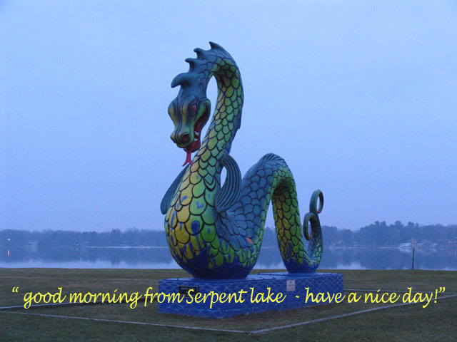
My first impression of this image is that it looks kind of flat. There is enough color variation and shadows on the serpent that this image should have a lot more depth to the look. Therefore, a bit of work is needed in post processing to get the most out of the subject you photographed. My suggestions for post processing are to bring up a levels layer and bump up the gamma a bit (the middle slider). Then do a brightness/contrast layer and boost the contrast and lower the brightness to compensate for bumping the gamma. Then after down sizing the image to 640 pixels, I would apply a bit of Unsharp Mask to help sharpen up the details in the serpent that get lost due to downsizing (Almost everyone sharpens their images after downsizing at DPC instead of before, as downsizing can cause artifacts when the image is really sharp). Give it a try. I think you will find that this image can be a very good tool for learning how to post process with PS. It has a lot of potential and I think you will be pleased with the results using the simple adjustments I've suggested.
Feel free to PM me if you have any questions regarding this critique, as I'd be more than happy to post process this image and send you the results.
Tim
Edit: Added sharpening comment.
Message edited by author 2006-11-30 08:03:46. |
|
Comments Made During the Challenge  |
|
|
11/26/2006 04:44:56 PM |
| Try enhancing the contrast. This is advanced editing, so you can either darken the sky and lighten the serpent or vice versa. I'd also move off the center line, probably to the right. And if you got a person in there for scale, that'd add some drama. |
|
 Photographer found comment helpful. Photographer found comment helpful. |
|
|
11/25/2006 09:10:40 PM |
Might the text have looked better at the top, possibly curving to frame the dragon? It just looks a little busy to me as is.
Cool dragon tho' :) He looks like me may be thinking more along the lines of trying the viewer for breakfast rather than giving him a cheery greeting ;) |
|
| Photographer found comment helpful. |
|
|
11/21/2006 11:12:35 AM |
| Your dragon isnt all that sharp and your writing covers up part of him. Also you can barely see the lake behind him. But I think mostly sharpening of the photo would have helped. |
|
| Photographer found comment helpful. |
|
|
11/20/2006 12:03:35 PM |
| I like the idea a lot. Wish it were a little less "blue". Consider using an "open shade" filter? |
|
| Photographer found comment helpful. |
|
|
11/20/2006 05:04:12 AM |
| i don't know what to say :-) the serpent could be in rule of thirds so the photo would have more impact. the photo also lacks contrast |
|
| Photographer found comment helpful. |
|
|
11/19/2006 08:44:03 PM |
| It looks like it needs to be color corrected. |
|
| Photographer found comment helpful. |
Home -
Challenges -
Community -
League -
Photos -
Cameras -
Lenses -
Learn -
Help -
Terms of Use -
Privacy -
Top ^
DPChallenge, and website content and design, Copyright © 2001-2025 Challenging Technologies, LLC.
All digital photo copyrights belong to the photographers and may not be used without permission.
Current Server Time: 04/07/2025 01:35:05 AM EDT.