| Author | Thread |
Comments Made During the Challenge  |
|
|
10/19/2003 03:40:47 PM |
| Here's a case where shooting a portrait from a (very) high angle makes sense. |
|
 Photographer found comment helpful. Photographer found comment helpful. |
|
|
10/19/2003 02:35:26 PM |
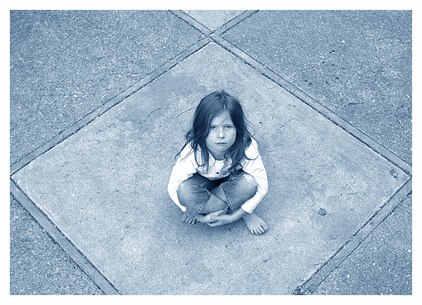
She certainly looks out there - and not particularly enamoured with the idea! Nice space and a good model. I would perhaps have cropped the top segment of the square out as it does not contribute in any way to the context of the shot. In fact I would probably have gone for complete symmetry and got the bottom square complete.
Good take on the challenge. |
|
| Photographer found comment helpful. |
|
|
10/19/2003 02:23:13 PM |
| Nice emotive photograph-- great angle -- |
|
| Photographer found comment helpful. |
|
|
10/18/2003 08:00:58 PM |
| I like your creative interpretation of this challenge topic, one of my 2 -10's this challnege. I think the barefootedness, the sort of straggly hair and the blue/gay tone worl really well, my only criticism might be that you only get the one square she is sitting in, in the photo, although the triangle in back does draw my eye adding depth, hmm not sure, well just a thought, i would like to see it the other way just to compare. great emotive worl |
|
| Photographer found comment helpful. |
|
|
10/18/2003 03:15:38 PM |
| I'm not certain how this fits into the challenge 100% - I hope she isn't normally 'concealed'. I like your composition, but the lighting is seems a bit strong, or overexposed. |
|
| Photographer found comment helpful. |
|
|
10/18/2003 11:08:55 AM |
| Perfect composition and great expression on her face. Ample negative space to imply the cold world. Tones and colors are just marvelous! |
|
| Photographer found comment helpful. |
|
|
10/17/2003 07:09:37 AM |
| Very effective photo and use of cold coloring. I think the contrasts could be a little more emphasized and the top cropped a little more so the next square isn't showing. |
|
| Photographer found comment helpful. |
|
|
10/16/2003 05:52:18 AM |
| This is good. The centering of your subject, although going against the rules of thirds etc etc, is not negative at all here. In fact I find it quite enhancing. The sepia toning is not overdone, and the border is very fitting. And that coming from someone who is not a big fan of borders anymore :-) Good symmetry.... |
|
| Photographer found comment helpful. |
|
|
10/15/2003 01:27:49 PM |
|
| Photographer found comment helpful. |
|
|
10/14/2003 04:05:12 PM |
| I like how you removed the color to convey your point - not to mention the good look on her face. |
|
| Photographer found comment helpful. |
|
|
10/14/2003 08:04:06 AM |
|
| Photographer found comment helpful. |
|
|
10/14/2003 04:48:14 AM |
| I had given this shot a 10, but after much thought decided to reduce the score to a 7, because I don't think it meets the challenge. Without the title, I'd be struggling to work out the relevance. It is one of my favourite shots this challenge though... the symmetry works well here as well as the background pattern and textures. I like the blue duotone. I just wish it fitted the challenge better. |
|
| Photographer found comment helpful. |
|
|
10/14/2003 04:11:15 AM |
| This is a strong photo and title. It would be stronger, IMHO, if the little girl weren't so centered. |
|
| Photographer found comment helpful. |
|
|
10/13/2003 08:52:26 PM |
| too mkuch reliance on the title, but a great shot |
|
| Photographer found comment helpful. |
|
|
10/13/2003 08:20:11 PM |
| Nice photo, but does not meet the challenge. 5 |
|
| Photographer found comment helpful. |
|
|
10/13/2003 06:15:14 PM |
| Is this your child? If so, she is wonderful at expressions. The sadness mixed with the sense of loss is so close to perfect. The setting of this shot is also great. The lines take you around the entire shot, cutting off the bottom draws you in, pulls you around the opening at the top takes you out or reverse! The black and white works well with this shot, but the contrast seems just slightly off to me, it might be my monitor but I have adjusted it to the grayscale bar on the bottom. I'm starting at a 9 but will be back. |
|
| Photographer found comment helpful. |
|
|
10/13/2003 09:47:44 AM |
| This is so good. Really a journalistic look and feel. The composition is the winner here along with nice tones and focus. |
|
| Photographer found comment helpful. |
|
|
10/13/2003 08:55:23 AM |
As an image - the subject with a cold blue tone and the breaking of the compositional rules works very well for me.
But as Challenge - Exposed, something hidden now revealed ; not sure that it meets it enough for my undersatnding. |
|
| Photographer found comment helpful. |
|
|
10/13/2003 07:14:21 AM |
| This is a beautiful shot. I love the color tone choice because it does relay a sense of 'cold' in this image. I think the centered composition also works with a lot of strength here. Excellent work... = 10 |
|
| Photographer found comment helpful. |
|
|
10/13/2003 06:26:32 AM |
Good Points: good symetrics (sp)
Bad Points: doesn't meet challenge - unless she is normally covered in something?NOT a snapshot mind you ;) |
|
| Photographer found comment helpful. |
|
|
10/13/2003 05:32:56 AM |
| I like this shot a lot. The pattern in the concrete and the symmetric composition really work here. The ONLY thing I MIGHT suggest would be to crop off the small triangle at the top, but that's just me. |
|
| Photographer found comment helpful. |
|
|
10/13/2003 04:34:27 AM |
| This is really very nice and what a great model...the pavement forms make a good setting for her as well as putting her size in perspective |
|
| Photographer found comment helpful. |
|
|
10/12/2003 10:55:25 PM |
| Dramatic photo, nice angle. The coloring really adds to the tone of the image, good light. Very sound photograph. 7 |
|
| Photographer found comment helpful. |
|
|
10/12/2003 10:41:59 PM |
| Great picture! I am sure that will be a winner! |
|
| Photographer found comment helpful. |
|
|
10/12/2003 08:14:03 PM |
Even in Black and White, I can tell this is a Sidwell girl. There are lots of things I really like about this shot. I'll start with those:
First, the details of the setup.
1. Her hair is not perfectly "coiffed." That sets the feeling of the "world" being unfriendly at times.
2. The hole in her jeans. As above.
3. Barefoot. As above.
4. Slight frown. As above.
Next, the composition
1. I like the centered subject. Works perfectly here.
Details of the shot:
1. I think that having her shirt washed out like that really blends it in with the border.
2. Also, the varying textures on the sidewalk around her really frames her nicely.
I think that one thing to try would have been having the entire square she's sitting in be in the shot, but her still in the center of the frame. I'm not sure that would have been better, because I can't picture it in my head too well, but it could be something to try, anyway.
Also, perhaps just slightly thinner on the border?
Overall, I really love this shot. 10 from me. |
|
| Photographer found comment helpful. |
Home -
Challenges -
Community -
League -
Photos -
Cameras -
Lenses -
Learn -
Help -
Terms of Use -
Privacy -
Top ^
DPChallenge, and website content and design, Copyright © 2001-2025 Challenging Technologies, LLC.
All digital photo copyrights belong to the photographers and may not be used without permission.
Current Server Time: 04/07/2025 12:05:52 AM EDT.