| Author | Thread |
Comments Made During the Challenge  |
|
|
08/11/2002 01:05:00 PM |
| could be great in black and white |
|
|
|
08/11/2002 02:59:00 AM |
| I would have liked to see more of the surroundings, looks boxed-in |
|
|
|
08/10/2002 03:13:00 PM |
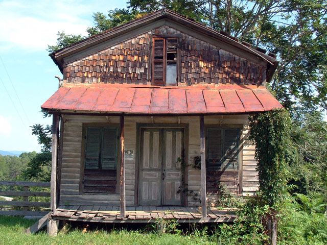
Something old. Use your photographic technique to emphasize the age of your subject.
Composition - pretty good
Technical Aspects - quite good. Did you try B&W?
Meets Challenge - yes
Visual Impact / Originality - high
I would guess that a B&W or sepia shot with the door, Posted sign, and window would be very good.
|
|
|
|
08/09/2002 12:18:00 PM |
| This was a really good subject to shot. |
|
|
|
08/09/2002 07:49:00 AM |
| Good subject. Photo is better than average, technically. Good effort. |
|
|
|
08/09/2002 02:20:00 AM |
|
|
|
08/08/2002 08:46:00 AM |
| this place is definitely old :) I believe that it would offer some more visual impact if it was shot from an angle to show some depth... the straight on view seems flat and less interesting than a view that has more three dimensional qualities :) - jmsetzler |
|
|
|
08/07/2002 11:47:00 AM |
| Great combination of textures in this building. |
|
|
|
08/07/2002 03:46:00 AM |
| I love buildings that look like they could tell a story. This one really does that. Very nice. |
|
|
|
08/06/2002 10:12:00 AM |
| what character. my only suggestion would be to move to the left just a hair, so the viewer could get an idea of depth by looking at the side of the biling as well. Looks like some of the terrain in my area. karmat |
|
|
|
08/05/2002 08:46:00 PM |
| I like the building..If you had taken it from a different and off center the composition would have been better |
|
|
|
08/05/2002 04:44:00 PM |
| Nice detail. Maybe this shot could have been taken farther away and not shot dead on. Looks like the fence on the left could have played a role in the picture too, shooting the house (store?) on an angle. (6). |
|
|
|
08/05/2002 04:12:00 PM |
| Technically very good, great subject, great picture... |
|
|
|
08/05/2002 03:07:00 PM |
most of the time, the straight-on... "here's a picture of an old house" look just doesn't interest me visually, but you have made that work in this shot. it appears to be a fine photo technically, well exposed, and maybe just a touch soft. the power lines on the right are not even much of an issue. the subject matter meets the challenge, it just leaves me wanting something more from this photo. I think its that the overall composition feels a bit unbalanced, heavy on the right side. ~mcmurma
Aesthetics...6
Meets Challenge...6
Overall...6 |
|
|
|
08/05/2002 02:04:00 PM |
|
|
|
08/05/2002 01:36:00 PM |
| it is old, isn't it. nice find. i'm not sure about the positioning of the house in the middle of the photo. i think i would have tried to position it all the way to the left (maybe even cropped off the edge) to get rid of that blank bit of sky on the left and to include more of the trees and such on the right). -- gr8photos (6) |
|
|
|
08/05/2002 11:04:00 AM |
| Very well done. Well presented, focus is good, lighting is good, subject is good... 8 |
|
|
|
08/05/2002 09:25:00 AM |
| I like the shadows, but wonder if it might have been a stronger pcture from another angle, rather than straight on. Just a thought. |
|
|
|
08/04/2002 09:51:00 PM |
| Nice. Very simple and direct with good color and detail. |
|
Home -
Challenges -
Community -
League -
Photos -
Cameras -
Lenses -
Learn -
Help -
Terms of Use -
Privacy -
Top ^
DPChallenge, and website content and design, Copyright © 2001-2025 Challenging Technologies, LLC.
All digital photo copyrights belong to the photographers and may not be used without permission.
Current Server Time: 04/06/2025 09:06:28 PM EDT.