| Author | Thread |
Comments Made During the Challenge  |
|
|
10/14/2003 03:52:12 PM |
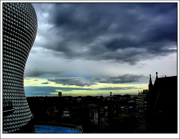
| I love the composition of this shot, but I wish there was a little more light on the distant buildings. Of course, then you'd have lost those wonderful clouds. I guess perfection just doesn't exist in nature. |
|
|
|
10/13/2003 09:28:56 AM |
| I absolutely love the colors in this picture and the darkness of the city its like a scene from a movie or something, And the building to the left looks great there Great picture! - 10 |
|
|
|
10/12/2003 03:52:42 PM |
| I like the contrast on the buildings. Makes it look like a futuristic urban landscape from a movie. The hues of colors you have in the sky incredible. Love the fluffy clouds. The rounded structure has a great curvy shape and helps to lead your eyes to the background. Excellent shot. "10" |
|
|
|
10/12/2003 07:15:23 AM |
| Incredible architecture. The colors of the sky and clouds are captivating. 9 |
|
|
|
10/11/2003 09:32:53 PM |
| Wonderful colors in the sky, wish the buildings were a little more noticeable. |
|
|
|
10/11/2003 03:47:21 PM |
| Nice viewpoint and composition. Sky looks great but your levels look a bit too dense in the dark areas where detail has been lost. However, given the subject I think you get away with it (Sean?). Very crisp focus all the way from foreground to horizon. Nice elevation too. [8] |
|
|
|
10/10/2003 05:54:24 PM |
| Good colors, I like the detail of the building on the left. Great sky. |
|
|
|
10/10/2003 08:36:13 AM |
| The cityscape is too dark to make out much of what's going on down there. NIce composition of the shot, though, especially the building on the left and the huge sky. |
|
|
|
10/10/2003 08:03:27 AM |
| Absolutely amazing sky and the curved building looks great against it, but the buildings below are simply too dark. I wonder whether a different angle which cropped out the buildings below but retained that sky would be stronger? Just wondering, so very possibly not! |
|
|
|
10/10/2003 04:55:23 AM |
| Looks like a kind of futuristic building. The stormy skies and color tones really do it for this image (9) |
|
|
|
10/09/2003 10:34:53 PM |
| Very interesting composition. I looks sharp, but the the darks are lost which is too bad, as this could have been amazing shot with more detail in it. The sky is very dramatic which ads mystery to the object on the left. I will come back to check where this is. |
|
|
|
10/09/2003 02:27:37 PM |
| Ah!!! teh new Selfridges building you lucky person ahving such as interesting structure to include. A pity PP for the challenge will not let you bring out any detail in the lower shadow area. |
|
|
|
10/09/2003 01:52:32 PM |
| A green sky, don't think I've ever seen a sky so green! Cool! I'm guessing the bullring is the building on the left? A beautiful building no doubt but seems to overpower the rest of the shot. And the rest of the shot seems too dark in contrast to the left side, the end of the day but if it could have been more focused and possibly a bit brighter I could have scored much higher on this one. |
|
|
|
10/09/2003 11:18:41 AM |
Year 2040AD :)
I like it! |
|
|
|
10/09/2003 07:13:58 AM |
| A feast! Interesting architecture and interesting sky. All the dark buildings don't add much but it's a nice picture. |
|
|
|
10/08/2003 05:42:44 PM |
|
|
|
10/08/2003 02:46:20 PM |
| framing is bad picture good 9 witout frame |
|
|
|
10/08/2003 02:06:20 PM |
| Too dark towards the bottom |
|
|
|
10/08/2003 10:46:00 AM |
| Good shot but the buildings are very dark ! adjusting the levels slightly could have made this even better than it already is... |
|
|
|
10/08/2003 08:09:42 AM |
| love the shape of the building and the color of the sky...great shot |
|
|
|
10/08/2003 07:50:08 AM |
|
|
|
10/08/2003 06:55:46 AM |
| Great sky, but I love the sexy curve on the left. Neat, interesting looking shot. |
|
|
|
10/08/2003 04:08:53 AM |
| Way too much sharpening, you can see bad artifacting all along the horizon. Interesting view, but the colours look a bit Photoshopped. 6 |
|
|
|
10/07/2003 10:21:52 PM |
| Like this photo with the building on the left side but I would have preferred to be able to see the other landscape of the city a little better. However, that is just my personal opinion. |
|
|
|
10/07/2003 09:46:29 PM |
| very pretty colours on the sky and clouds. Bl\uildings below too dark though. 7 |
|
|
|
10/07/2003 09:39:49 PM |
| Neat love the sky really emphasises landscape = 9 |
|
|
|
10/07/2003 09:03:49 PM |
|
Home -
Challenges -
Community -
League -
Photos -
Cameras -
Lenses -
Learn -
Help -
Terms of Use -
Privacy -
Top ^
DPChallenge, and website content and design, Copyright © 2001-2025 Challenging Technologies, LLC.
All digital photo copyrights belong to the photographers and may not be used without permission.
Current Server Time: 04/07/2025 01:06:44 PM EDT.