| Author | Thread |
Comments Made During the Challenge  |
|
|
08/11/2002 09:30:00 PM |
| Great colors, lighting, subject. I like this one alot. 7 sjgleah |
|
|
|
08/11/2002 03:25:00 PM |
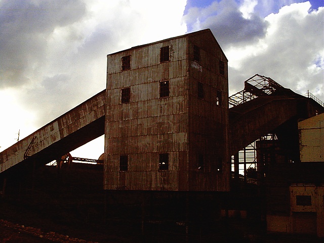
| beautiful shot! the sky is very dramatic, and I love the colors and composition. are you sure it's a power station? looks like a grain elevator or something. |
|
|
|
08/10/2002 10:42:00 PM |
Nice photo! I like the lighting. With the bright background the building is almost only a silhouette. It has enough light to show the rusty surface but not too much so that too much unimportant details in the bottom area are revealed.
Maybe off-centering the subject and moving the camera to the left would have made it even more effective.
-stephan |
|
|
|
08/10/2002 07:32:00 PM |
Something old. Use your photographic technique to emphasize the age of your subject.
Composition - good
Technical Aspects - good. I'd also like to see a version in B&W with sun in front.
Meets Challenge - probably. Don't confuse old with unused.
Visual Impact / Originality - good
|
|
|
|
08/10/2002 04:36:00 PM |
| What little sky is visible is an impressive colour, but the foreground is just too dark. |
|
|
|
08/09/2002 02:45:00 PM |
| Great subject. Underexposed for the subject. |
|
|
|
08/09/2002 10:11:00 AM |
| If you angle the camera and posiiton the bulk of the building further right, I think the ramp-like structure would lead the eye into the photo, and create a neat diagonal line. I do like, however, how the wirey structure on the right forms a silouette, and I'm not trying to be a "rule of thirds" stickler, just wondering if the right part of the photo is needed as it really is made up of a lot of non-descript boxy structures. Love the sky. |
|
|
|
08/09/2002 02:48:00 AM |
| just a little too dark for my taste |
|
|
|
08/08/2002 05:27:00 PM |
| Seems so very dark, were you going for a gloomy effect? I think I should be glad this is an old power station, it looks like a coal burner. Foreground almost completely gone. On the other hand, I like the sky part. 6 Swash |
|
|
|
08/08/2002 05:12:00 PM |
| this is an interesting scene, but I think that some more light in the foreground would possibly make it stand out more :) - jmsetzler |
|
|
|
08/07/2002 09:49:00 PM |
| a little more light in the foreground |
|
|
|
08/07/2002 01:57:00 PM |
| beautiful contrast between the building and the sky |
|
|
|
08/07/2002 05:15:00 AM |
| Nice pseudo-silhouette. Great sky. Looks like you had to do a little processing to get the detail visible enough. Works for me. |
|
|
|
08/06/2002 10:44:00 PM |
| composition is good as is the subject..I think a duller sky would work |
|
|
|
08/06/2002 07:52:00 PM |
| subject is excellent - exposure detracts from this fine selection |
|
|
|
08/06/2002 03:42:00 PM |
| Very strong foreground. I think the photo really benefits from the building and related structures being thrown into shadow against the bright cloudy sky. The strong lines of the middle building and the diagonals of the ramp really hold my attention. Great job. |
|
|
|
08/06/2002 02:45:00 PM |
| a little too dark, unfortunately. |
|
|
|
08/06/2002 02:23:00 PM |
| I like the way the angles lead my eyes from left ot right, and the colors in the sky are really nice. It is a little dark for me in the foreground, though. I feel like I am missing some nice details. karmat |
|
|
|
08/06/2002 01:37:00 PM |
| Pity about the darkness at the bottom, perhaps it could have been cropped more. Otherwise I like it very much. |
|
|
|
08/06/2002 10:27:00 AM |
| The building seems under exposed, and my attention drifts to the sky. This is probably because you shot the shady side, and the camera's auto exposure metered to the sky. You can bump it up a stop or two or use post-processing to correct it. |
|
|
|
08/06/2002 10:05:00 AM |
| this image looks very dark on my computer, i can barely make out the detail on the right side of the building and the bottom is pretty much black for me. the building was a good subject to pick, but i'm not to thrilled with its placement right in the middle of the shot. maybe more too one side ... -- gr8photos (3) |
|
|
|
08/06/2002 08:13:00 AM |
| I like the shapes here, but I wish the foreground had been a bit lighter. |
|
|
|
08/05/2002 09:45:00 PM |
| The subject matter is good, but a better time of day for better lighting is a must... |
|
|
|
08/05/2002 08:32:00 PM |
| love the dark, overcast sky and mood. nice angle. almost like a painting |
|
|
|
08/05/2002 05:07:00 PM |
| Nice subject idea. I would have liked it more if the large building wasn't almost dead center, and it is also a little dark for my taste. lhall |
|
|
|
08/05/2002 03:46:00 PM |
| I like this composition--very strong--good contrasts--nice flash of blue above |
|
|
|
08/05/2002 02:33:00 PM |
| I love the sky in this. I bet the uncompressed version has great detail on the building. |
|
|
|
08/05/2002 08:49:00 AM |
| Nice photo. Focus is good. Looks a bit dark. |
|
|
|
08/05/2002 08:19:00 AM |
| A little dark at the bottom |
|
|
|
08/05/2002 08:02:00 AM |
| would have been much better had this not been so dark. its between silhouette and detail. |
|
|
|
08/05/2002 03:41:00 AM |
| its nice, but i find it a little bit too dark. |
|
|
|
08/05/2002 02:33:00 AM |
| Wow! It's so deep, like the darkness represents the twilight of the coal age! |
|
|
|
08/05/2002 02:26:00 AM |
Nice, looking at this makes me think of time come and gone. I can also almost see the workers coming and going, and then slowly fading away. It is a little dark, and hard to make out on the bottom, but still overall quite nice.
|
|
Home -
Challenges -
Community -
League -
Photos -
Cameras -
Lenses -
Learn -
Help -
Terms of Use -
Privacy -
Top ^
DPChallenge, and website content and design, Copyright © 2001-2026 Challenging Technologies, LLC.
All digital photo copyrights belong to the photographers and may not be used without permission.
Current Server Time: 02/01/2026 10:01:51 AM EST.