| Author | Thread |
Comments Made During the Challenge  |
|
|
08/11/2002 06:28:00 PM |
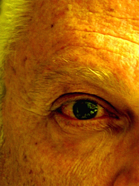
| Oh! Scary! It's a little spooky to me. |
|
|
|
08/11/2002 05:24:00 PM |
| Yes, its old, but i don't like the colors and would like to see more of the face. 4 sjgleah |
|
|
|
08/11/2002 05:54:00 AM |
| very nice personal shot and good colors, a bit out of focus? |
|
|
|
08/10/2002 07:07:00 PM |
I'm not sure if the lighting and the coloring fits the subject. I think it would have been more effective if you would have used light from the side. That way the skin would have more shadows and more contrast and the wrinkles were more visible. This would increase the old look. Also black & white would be better in my opinion. I also would like to see more of the person. A portrait would be nicer.
Anyway. Despite of all that. overall I still think it's a nice photo.
-stephan
|
|
|
|
08/10/2002 11:57:00 AM |
| good framing, lighting. I like it. |
|
|
|
08/09/2002 07:46:00 AM |
| Good idea. Coloration is a little off and focus a little soft. |
|
|
|
08/08/2002 03:08:00 PM |
| Very good, is this from one of those swivel lens cameras? Seems very yellow and orange, esp. the forehead area. Suggestion: move the light to the other side, I think the eye reflection might have worked out better. A face that has earned it's lines, very courageous of you! (are you autool?) 8 Swash |
|
|
|
08/07/2002 05:46:00 AM |
| Interesting :) I read your comments on this photo earlier in the forums... I think the composition on this photo would be better if the eye was located in the upper left third of the frame. The yellow tinting is a 'neat' effect but I don't really see what it adds to the photo. It doesn't 'take away' but it's not really a value-added enhancement for me. I also think that some more sharpness would accent the wrinkles and 'age' attributes of the face... good shot :) - jmsetzler |
|
|
|
08/06/2002 07:41:00 PM |
| I like the capture of detail, and it is an interesting picture. However the yellow cast detracts from it for me. If it was on purpose, I apologize, if not, trying adjusting white balance or a different kind of lighting. karmat |
|
|
|
08/06/2002 03:00:00 PM |
| Very very good! One of my top picks this week. |
|
|
|
08/06/2002 12:39:00 PM |
| The yellow cast may have been intentional, but I find it rather unsettling. lhall |
|
|
|
08/06/2002 09:48:00 AM |
| Love the composition, the colours work really well but the sharpness lets it down. |
|
|
|
08/06/2002 09:02:00 AM |
| I like the crop on this. It's a nice photo :) |
|
|
|
08/06/2002 04:12:00 AM |
| unfocused beyond being artistic. would have liked to see the eye colors. |
|
|
|
08/05/2002 05:41:00 PM |
Something old. Use your photographic technique to emphasize the age of your subject.
Composition - quite good
Technical Aspects - quite good
Meets Challenge - yes
Visual Impact / Originality - good/high
|
|
|
|
08/05/2002 02:22:00 PM |
| Wow - talk about a striking image. That yellow tint has to be intentional - it's very strong indeed. The focus seems just a little off - was this a very close-in crop of a larger photo? |
|
|
|
08/05/2002 10:43:00 AM |
| Very nice. The lighting is a little harsh, but I enjoy this photo. |
|
|
|
08/05/2002 09:49:00 AM |
|
|
|
08/05/2002 09:31:00 AM |
| You are so close to having a fantastic photo. Maybe if the light were even less direct so as highlight the edges. I like the crop. Great focus. It's a little yellow, to (Or you have jaundice! ha ha) Have you tried palying wiht your white balance? |
|
|
|
08/05/2002 08:19:00 AM |
| hehehe, funny idea! i wonder if you deliberately chose the yellowish light, IMHO it doesn't really add to the shot. also seems slightly soft, running it through unsharpen mask once helps. -- gr8photos (4) |
|
|
|
08/05/2002 07:48:00 AM |
|
|
|
08/05/2002 03:11:00 AM |
| I like this photo a lot despite its low resolution. The bold colours and the composition are very appealing to me. |
|
|
|
08/04/2002 11:46:00 PM |
| i think this would look better without the very prominant orange/yellow colour, and if it was in focus a tad bit more. |
|
Home -
Challenges -
Community -
League -
Photos -
Cameras -
Lenses -
Learn -
Help -
Terms of Use -
Privacy -
Top ^
DPChallenge, and website content and design, Copyright © 2001-2025 Challenging Technologies, LLC.
All digital photo copyrights belong to the photographers and may not be used without permission.
Current Server Time: 04/08/2025 03:04:40 AM EDT.