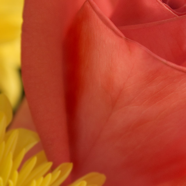
Bought a floral bouquet for something I wanted to do as part of the self-portrait challenge, but that didn't work out. I don't really have macro capability, so this is what you get, and yes, I realize it's pretty recognizable. :-)
Used my 500W shop light diffused by a sheer curtain. Post processing included a crop, then NI, then smart sharpen, then some dodging, some burning. Then a duplicate layer which I used to apply gaussian blur, then erased part of the rose on that layer.
No clue how this will do at all - I'm not a flower picture person as far as ability or tendency but I'm always willing to try new things.
Statistics
Place: 203 out of 285 Avg (all users): 5.1316 Avg (commenters): 6.0000 Avg (participants): 4.9545 Avg (non-participants): 5.3750 Views since voting: 914 Views during voting: 206 Votes: 152 Comments: 5 Favorites: 1 (view)
Technicals: lighting is excellent, focus and sharpness are not as important as you were going for soft. Composition is not bad, but I think is part of what is hurting this shot. See below.
The feel: since there are few patterns or geometries in the majority of the canvas, this picture is going to be about color. As a color shot, it isn't super exciting. 4/5th of the frame is one color and 1/5th is another, but there is little interaction or dynamics between the two. If you look at other rose macros, you will see they usually concentrate on the pattern of the petal whorl. This adds something to the picture and it's missing here. I give you props for trying something that isn't stock, but unfortunately you didn't come up with a superior result.
The game: Ya, you know what flowers are like on DPC. They can win, but they need to be done creatively and perfectly to do so. I bet the people who gave you 4s sensed the compositional weakness and then stuck it to you extra for doing it with a flower...
BTW, I didn't notice before you have such a sweet lens! My absolute favorite. (well, it's my only lens...)
Trading post...
I thought this was fantastic. I gave it a 7 in voting. The colors are sweet and even though it has a soft look you can see all the detail in the main petal. Wonderful job. The voters suck!
I gave this a 6 in challenge Deb. I thought the muted colors were nice and the general composition pleasing as well. I think the upper right and lower left corners balanced each other well and fro some reason I was drawn to the upper right. Nice lines and angles. While maybe not one of your best shots it was surely stronger than a 5.1 Way to go on trying something new.
Wow, Deb! I don't get it. . . this photo is gorgeous! I'm not a huge fan of abstract or macro, but a photo like this makes me rethink my tastes! I guess if it doesn't have sharp crisp detail, the general populous must not think its a macro. I certainly disagree, but then, what do I know, huh?