| Author | Thread |
|
|
08/26/2006 08:55:12 AM |
Hello from the Critique Club!
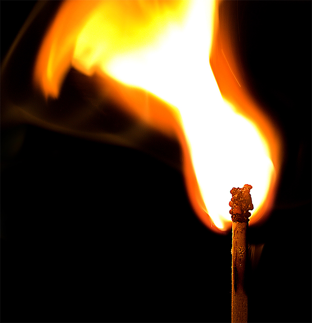
This image proved to be a little hard for me to critique.
The composition is very nice and the exposure on the match itself is excellent (you pulled a lot of detail out) but there is something bothering me.
The big white blob in the middle of the flame is overpowering the composition area. And the fact that there is no detail in that area makes the blob ever bigger to the eye. Don't get me wrong here you have a potentially excellent image here, and I could read all your post- processing remarks and tell you worked hard on this image, but in my opinion, it barely misses to present itself with full power.
Maybe there could be something done with the crop, (maybe shift it to the left just a tad) Or shoot the same shot with a slightly smaller flame.
The colors are nice and the background fits to give emphasis to both the match and the flame. I also like the shape of the flame. It fits the challenge perfectly.
Overall good job because I have found that working with fire isn't always easy.
:)
|
|
 Photographer found comment helpful. Photographer found comment helpful. |
Comments Made During the Challenge  |
|
|
08/20/2006 02:34:31 PM |
|
| Photographer found comment helpful. |
|
|
08/18/2006 03:01:36 PM |
| I like how you can see the paint bubbling on the match. Good capture. |
|
| Photographer found comment helpful. |
|
|
08/17/2006 05:31:24 PM |
| Very nice but the match head looks strange |
|
| Photographer found comment helpful. |
|
|
08/17/2006 10:00:45 AM |
| Nicely done macro of the match |
|
| Photographer found comment helpful. |
|
|
08/15/2006 02:15:35 PM |
|
| Photographer found comment helpful. |
|
|
08/15/2006 03:35:47 AM |
| I'd like if this werent cut off at the top but nice color and contrast. |
|
| Photographer found comment helpful. |
|
|
08/15/2006 01:44:20 AM |
| For me too much of the flame is blown out here but I do like the detail in the head of the burning match :o) |
|
| Photographer found comment helpful. |
|
|
08/14/2006 05:58:14 PM |
| There are too many matches, and hardly any of them are special. This one doesn't stand out for me. |
|
| Photographer found comment helpful. |
|
|
08/14/2006 03:08:37 PM |
I would have liked to see more detail in the flame and it is a little over exposed. Meets the challenge. 6
Wazz |
|
| Photographer found comment helpful. |
|
|
08/14/2006 01:40:13 PM |
| The shot does not say explosion to me, as my perception of explosion is bits flying off a central point, but not marking down for that. I could see how you might be getting marked down for harsh contrast, but I personally am a fan of high-contrast shots. I love how the match is in focus so that the small details are visible. |
|
| Photographer found comment helpful. |