| Author | Thread |
Comments Made During the Challenge  |
|
|
08/13/2006 02:12:33 PM |
| Seems to lack clarity. Don't like the cool, muted colors. |
|
|
|
08/11/2006 12:31:57 PM |
|
|
|
08/11/2006 11:43:07 AM |
| Nice image, but I'm not sure I like the effects... has a paste/plastic feel to it. |
|
|
|
08/11/2006 09:05:35 AM |
| Nice shot. If you have photoshop (I'm not sure about other apps), you could use perspective correction to straighten out the tower on the left. I think that might strengthen this image. |
|
|
|
08/11/2006 06:55:07 AM |
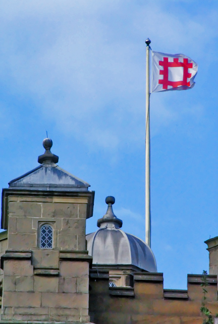
| I've seen concrete/stone look like that before. It's when I used too much NI! ;^) You've lost detail with the noise reduction. The motion of the flag is stopped quite nicely. This image could stand a slight shift to the left in rotation (1 or 2 degrees) as it's not lined up horizontally. Good luck in the challenge. |
|
|
|
08/10/2006 07:06:47 PM |
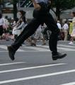
| You've done well stopping the motion of the flag, but I feel that something which might show more motion may make a stronger subject. |
|
|
|
08/10/2006 04:12:31 PM |
if you are going to get so far out of the box that people aren't sure how you're meeting the challenge, you really need to have an outstanding shot. sorry, but this isn't one of them. it's not that sharp, your horizon is off, and the composition doesn't really offer much.
if you want better scores, maybe check out this thread. |
|
|
|
08/10/2006 03:50:43 PM |
| I guess the stopped motion is the flag, since I'm thinking the buildings aren't going anywhere. A bit plain for this challenge. |
|
Home -
Challenges -
Community -
League -
Photos -
Cameras -
Lenses -
Learn -
Help -
Terms of Use -
Privacy -
Top ^
DPChallenge, and website content and design, Copyright © 2001-2025 Challenging Technologies, LLC.
All digital photo copyrights belong to the photographers and may not be used without permission.
Current Server Time: 04/07/2025 10:27:18 PM EDT.