| Author | Thread |
Comments Made During the Challenge  |
|
|
07/28/2002 01:03:00 AM |
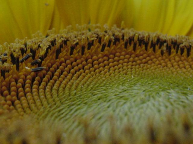
I very much like the idea and the composition. Although it may be intentional, it is too dark for me - I can't really enjoy it (and yes my monitor is adjusted correctly). It is a great photo, but needs a little work. 7
Ruthann |
|
|
|
07/27/2002 10:20:00 PM |
| depth of field loses the detail in the foreground |
|
|
|
07/26/2002 12:08:00 PM |
| Interesting focus. I like the blur in the foreground (normally I don't). And like how you have actually caught several different textures at one time. don't know if you use any post-processing, but if you can, it might make the picture have a little more zing if you brighten it up a little by adding some saturation and brightening/contrast. karmat |
|
|
|
07/25/2002 11:51:00 PM |
| The sun needs some more depth of field. Also, it's a bit dull. |
|
|
|
07/25/2002 11:48:00 PM |
| good choice of framing for this one. Brings out the texture. |
|
|
|
07/25/2002 08:38:00 PM |
| Needs greater depth of field. Also the lighting makes it quite dull. Perhaps you could have done something with the contrast, saturation or lightening tools to brighten it up. |
|
|
|
07/25/2002 04:45:00 PM |
| This is an O.K. Macro shot. My issues are: it's a bit dark and the depth of field isn't as wide as I would like to see it. The lower and upper 1/4 of this shot are out of focus. I know the shot would have been a little lower interest, but straight on would have avoided some of this. 6 Swash |
|
|
|
07/25/2002 12:53:00 PM |
a bit dark, but nice composition. it makes for an interesting image. some ppl may complain about the sharpness, but i like the fuzzy foreground. it adds depth. i wish it had a bit more color... ~mcmurma
Aesthetics...6
Meets Challenge...6
Overall...6 |
|
|
|
07/25/2002 10:39:00 AM |
| This has some rich textures. However, the photograph would be more successful with the levels/curves kicked up a bit, and the saturation (for yellow and a bit on green) boosted. Was it a cloudy day, or did you take this indoors? Nice idea, good texture, bad lighting. |
|
|
|
07/25/2002 01:44:00 AM |
| I really like the idea, but I'd like to see this much brighter and bolder -- better lighting? levels adjustment? |
|
|
|
07/24/2002 09:08:00 PM |
| Could be a little lighter, but I still think it's a very neat photo |
|
|
|
07/24/2002 03:38:00 PM |
| I like the concept.. probably would have backed off a little and played with the depth of field a little though. |
|
|
|
07/24/2002 02:23:00 PM |
| Colours are very weak. Good close up though. |
|
|
|
07/24/2002 01:16:00 PM |
| surface of the sun FLOWER. hehehe. :-) |
|
|
|
07/24/2002 09:08:00 AM |
Composition5
Originality6
Technical Aspects5
Meets Challenge8
Total Score6
For those that are just learning, like me.
Composition: Scoring in this area is based on basic composition of a picture and includes the rule of thirds, balance, cropping, and curved and diagonal lines. Subject matter that does not lend itself to the picture or otherwise unwanted is also considered here.
Originality: Scoring in this area is based on pictures or concepts that I have seen, as well as how much effort you have invested in the picture. Usually a little something that sets it aside from a snapshot. Does it make me want to come back for another look? You know things like that.
Technical Aspects: Focus, exposure, lighting, and other special effects (done by the camera), and post processing are all considered in this category.
Meets Challenge: This is based on my interpretation of if you, have/have not, met the challenge. This is fairly simple but quite important for this site.
There are many sites that can give you assistance in achieving better skills in photography, but I think the best way to learn is to take pictures and show them to other people. Believe me when it is a good one you will know it.
Good luck!
Autool
|
|
|
|
07/23/2002 09:09:00 PM |
| I really like the texture and the angle you've captured here, but it would be nicer to see the colors brighter and more vibrant - some extra post-processing would do wonders for this! |
|
|
|
07/23/2002 09:56:00 AM |
| A trifle too dark, but nicely composed. |
|
|
|
07/23/2002 08:12:00 AM |
| good idea, but the colors look a bit funny to me and a little more light & DOF would have helped, too, IMHO. try less jpeg compression, too and see if that gives you better definition - I'd expect it to. 5 beegee |
|
|
|
07/23/2002 02:04:00 AM |
| A bit dark and bland for a sunflower |
|
|
|
07/22/2002 03:59:00 PM |
|
|
|
07/22/2002 03:39:00 PM |
.
Message edited by author 2003-09-19 03:09:00. |
|
|
|
07/22/2002 03:19:00 PM |
| good texture but this photo definitely needs some more light to make the colors punch... = 5 - jmsetzler |
|
|
|
07/22/2002 01:35:00 PM |
| The idea is good, but it needed more light and contrast. |
|
|
|
07/22/2002 12:33:00 PM |
| Nice photo but its a shame that it isn't in focus |
|
|
|
07/22/2002 12:00:00 PM |
| My eye is bothered by the immediate foreground being out of focus. |
|
|
|
07/22/2002 09:36:00 AM |
|
|
|
07/22/2002 08:32:00 AM |
| The "texture" is great, but I feel that the picture is too dark. |
|
|
|
07/22/2002 06:39:00 AM |
| Nice texture! but poor lighting and focus spoil this shot |
|
Home -
Challenges -
Community -
League -
Photos -
Cameras -
Lenses -
Learn -
Help -
Terms of Use -
Privacy -
Top ^
DPChallenge, and website content and design, Copyright © 2001-2026 Challenging Technologies, LLC.
All digital photo copyrights belong to the photographers and may not be used without permission.
Current Server Time: 02/01/2026 11:00:36 AM EST.