This is a tough one to offer a critique-like comment on as there is obviously a number of avenues that would've been available had editing been allowed.
As it was a straight-from-the-camera challenge, I'll pretend this is a perfect world and offer suggestions that I think would help improve this image even more from the outset.
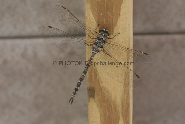
Firstly, the dragonfly is a great subject, they are always interest to me and they tend to provide some wonderful color combinations. In this case the colors are a bit muted, I see some turquoise blue and browns that would benefit greatly to a push in saturation - since that's not possible I wonder if a polarizer would've helped enhance those colors from the outset or not? They seem to work with the sky, but I can't be sure if they'd do the same elsewhere.
The wings and tail look soft, this makes them blend into the background which isn't terribly helpful since they are part of your main subject. Getting those two aspects into a sharper focus would help separate the dragonfly from the background and really center the viewer's attention on it as well as offer even more details for us to examine.
The composition works here, though I wish it were skewed a bit differently, so there was more negative space to the left, this would help isolate the dragonfly even more and focus more attention on it, IMO, and offer a more artisitc flare that isn't available in the current nearly centered positioning. This would be fixable by cropping but for this challenge just a shift of the camera more to the left would do the same as well.
Next, the background of this image isn't very interesting, the muted colors extend their dullness to the whole image and give it an almost washed out appearance. Now I know that this isn't a perfect world and dragonflies are typically pretty skittish in my experience, but if it had been possible, it'd be great to have a 'faux' background put up behind the beam. Something in a color that would contrast both with the wood and the coloring of the dragonfly, without creating too much light reflection. I want to say maybe a plum or mid-hued green piece of posterboard might do the trick, but its hard to say whether either of those would actually contrast in a complimentary way (color-wise) the dragonfly.
Considering the challenge I think you provided some good bones to work with. I'm sure you could rescue this from the bland color and lighting with some editing, so the photo has many possibilities. You did well in your capture overall in my opinion, despite the suggestions I do make.
Finally I disagree with the previous comment, I think the angle of the dragonfly adds interest, with it being askew the eye moves from viewing in a completely vertical nature to a diagonal and it helps break up the image a bit. |