| Author | Thread |
|
|
07/17/2006 02:54:36 AM |
* Greeting from Critique Club *
Before to write the critique I have read the comment of DrAchoo. It's difficult to write other after that comment that I subscribe.
Best regards |
|
 Photographer found comment helpful. Photographer found comment helpful. |
|
|
07/12/2006 09:30:00 AM |
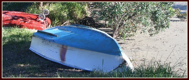
You have the opportunity to learn a lot on this one because there was a shot with the exact same idea which scored much better (look at 5th). What makes the difference? A few things.
1) Distracting elements. Notice that anmldoc's shot has nothing to distract in the background. It is actually quite sparse with the sky dominating the canvas. Your shot has the bright red boat in the background (the color makes our eye not sure which boat you really wanted as the subject) as well as the trees which have a ton of little detail (which unfortunately gets pretty obliterated at 640 pixels).
2) Lighting. Actually you didn't do too bad a job, but you can see how your lighting is harsher than anmldoc's. The bright sand dominates more of the canvas. I can see by the shadows you didn't shoot at midday, so that's good. I think perhaps you oversharped the picture (although you didn't mention that in your notes).
anyway, really take a look at your's vs. the 5th place entry. I think you can take quite a bit away. Good luck with future entries. |
|
| Photographer found comment helpful. |
Comments Made During the Challenge  |
|
|
07/11/2006 05:00:10 AM |
|
| Photographer found comment helpful. |
|
|
07/10/2006 11:11:28 AM |
| The wheels on the bottom of that red boat are interesting. However, I think the composition would be stronger without the red boat. Nice proportion of sand/greenery/subject. |
|
| Photographer found comment helpful. |
|
|
07/09/2006 02:44:15 AM |
| The soft focus of this image suggest that there might be some camera shake involved. Compositionally, I have a couple of suggestions you might try. First, I would have liked to have seen the all of the red boat in the picture. The color of the red boat complements the colors of the blue boat; however it should be part of the story instead of just looking like something stuck in the background. Second, if you would have moved to the left to get more of the beach and water into the image, it would have better supported your title Low Tide. As it is, I almost missed the water in the far right corner, thus the boat looked like it was being stored. |
|
| Photographer found comment helpful. |
|
|
07/07/2006 11:45:49 AM |
This picture has been hugely over-sharpened.
Methinks it would have benefitted from being softer, rather than being made more harsh, especially with all of the fine detail it already contains.
But that's just my opinion. |
|
| Photographer found comment helpful. |
|
|
07/07/2006 06:33:31 AM |
| I like the different crop and the idea for the theme. It seems you used shaping light to take the photo but I think using flat or back lighting would made more of an impact. |
|
| Photographer found comment helpful. |
|
|
07/06/2006 06:05:30 AM |
| I like the boat with wheels in the back left. ;^) |
|
| Photographer found comment helpful. |
Home -
Challenges -
Community -
League -
Photos -
Cameras -
Lenses -
Learn -
Help -
Terms of Use -
Privacy -
Top ^
DPChallenge, and website content and design, Copyright © 2001-2025 Challenging Technologies, LLC.
All digital photo copyrights belong to the photographers and may not be used without permission.
Current Server Time: 04/08/2025 01:38:23 AM EDT.