| Author | Thread |
Comments Made During the Challenge  |
|
|
07/21/2002 06:34:00 PM |
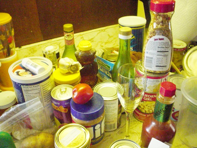
| Too busy for me. Looks like the white balance is not set right. Yellow cast everywhere. |
|
|
|
07/21/2002 12:17:00 PM |
| OK, maybe it's just me -- but I can't even see any of the flies. The color of the picture is very yellow -- if you have the ability, try to use the white balance in your camera. If you don't maybe adjust them in an image editing program. But more than anything, and as mean as it may sound, I'd suggest looking for a different subject. |
|
|
|
07/21/2002 04:43:00 AM |
| sorry...I don't get it. I see no flies. The picture has an unatural yellow cast too. |
|
|
|
07/20/2002 09:40:00 PM |
| Too yellow... it has no artistic value to me |
|
|
|
07/20/2002 01:14:00 PM |
It's simply not a high quality photo. It's way too yellow and a bit fuzzy
-6 |
|
|
|
07/19/2002 01:42:00 PM |
| ??? Your point? It's a bit grainy and cluttered. 4 Swash |
|
|
|
07/19/2002 10:40:00 AM |
| The title makes the shot make sense, but there's nothing here to give the eye a place to rest. The shot is too busy and chaotic for my taste. 5-ClubJuggle |
|
|
|
07/18/2002 11:19:00 PM |
| Donde estan las moscas? The yellow light gives it an surreal feeling. |
|
|
|
07/18/2002 07:02:00 PM |
| Not sure about the concept of this shot, its cluttered with no focus on a specific item. The yellow green cast is a bit too much, I dont get it either because I dont think its a white balance problem because you have visible whites in this shot. |
|
|
|
07/18/2002 09:31:00 AM |
| There is really a lot going on here. I think the shot would have had more impact to me if there was a more defined continuity to the objects, and fewer of them. The shot has a lot of potential, but I think with less happening in it, it would be a stronger shot. |
|
|
|
07/17/2002 09:06:00 PM |
| Very much like a snapshot, too much green. 2 sjgleah |
|
|
|
07/17/2002 01:50:00 PM |
| haha excelent composition and nicely yellowfied tints |
|
|
|
07/17/2002 01:38:00 PM |
|
|
|
07/17/2002 12:18:00 PM |
| a bit less color contrast |
|
|
|
07/17/2002 11:57:00 AM |
| poor coloring (very hazy and washed out). bad lighting (causing washed out colors and pixellation). composure needs work (the wooded part on top doesn't work well with the rest of the image). |
|
|
|
07/17/2002 10:39:00 AM |
| don't see any flies, but can see why you expect them imminently. not a very appetizing photo. the yellow tint doesn't help. and the wine glass looks too clean. this photo just doesn't do anything for me, sorry. -- gr8photos (2) |
|
|
|
07/17/2002 09:48:00 AM |
| Was the yellowish cast intentional? If not, adjusting the white balance on your camera, if possible, or in post-processing, if accessible, may eliminate it for you. There may simply be too much "stuff" in this picture, especially with the empty space behind it. If the entire countertop (?) had been full of stuff, it would look more intentional. |
|
|
|
07/17/2002 08:36:00 AM |
| good composition, lighting a little too washed out. |
|
|
|
07/17/2002 07:18:00 AM |
| The lighting is very strange on this. Also, nothing has a tight focus on it. |
|
|
|
07/17/2002 06:19:00 AM |
| no veo las moscas...adonde estan? this is just too random for my taste. hell, i could've done this. |
|
|
|
07/16/2002 10:34:00 PM |
|
|
|
07/16/2002 12:15:00 PM |
|
|
|
07/16/2002 10:00:00 AM |
| This picture is completely uninteresting. Clutter like this in a house is not pleasing to the eye, and not in a photograph either. Also, white balance seems off (photo is too yellow) and also seems "noisy" (lots of pixel noise) |
|
|
|
07/15/2002 04:24:00 PM |
| Too much too look at, and I find the yellow unsettling. |
|
|
|
07/15/2002 01:07:00 PM |
| There is too much of a yellow tint to your lighting. Also, I'm wondering why you would want to photograph a cluttered countertop. If I know I have company coming, I tried to hide my junk. |
|
|
|
07/15/2002 11:39:00 AM |
| Not sure I get the title but I like the shot..... color and interesting. Kee |
|
|
|
07/15/2002 11:29:00 AM |
| I don't get this photo at all. The lighting and clarity aren't any better. Sorry |
|
|
|
07/15/2002 09:20:00 AM |
| I think your photo is a bit 'busy' for my taste (pardon the pun). Also, an improper white balance setting through off your colors. |
|
|
|
07/15/2002 02:24:00 AM |
| This is a little too busy to suit my own taste.. the yellow tint may be removed with some white balance or level adjustments in software... = 3 - jmsetzler |
|
|
|
07/14/2002 11:34:00 PM |
| I think there is just too much stuff in this shot... though a lower angle might help with that. There is also too much noise. Use a lower ISO and use a tripod if you have to. |
|