| Author | Thread |
|
|
05/27/2006 06:25:25 PM |
::: Critique Club :::
Hi, my name is Kari and from the critique club.
First Impression - the most important one:
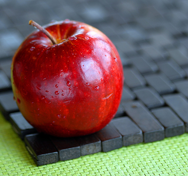
The green and red look great .. but what is the placemat there for?
Composition:
interesting composition .. I am not an expert at still life .. but I like how you have set up this .. and cropped ... to a point I want to turn the apple around to create a leading line with the stem .. but not sure if that would work.
Subject:
meets the challenge.... does it well.
Technical (Colour and light):
Great colour and nice lighting .. .the actual reflection of the windows is a little distraction though.
To grow its vote?:
simple pictures with basic elements have taken out this challenge .. I think taht the mat addedd complexity that wasn't needed.
Summary:
Good work . something quite out of the box for you ... keep it up.
If you've got any questions about this critique, please feel free to contact me via the PM system.
Cheers
Kari |
|
 Photographer found comment helpful. Photographer found comment helpful. |
Comments Made During the Challenge  |
|
|
05/23/2006 06:19:13 AM |
| i like the mix of color and texture |
|
| Photographer found comment helpful. |
|
|
05/22/2006 10:01:26 AM |
| The drops on the apple complete this photo. Very nice. |
|
| Photographer found comment helpful. |
|
|
05/20/2006 07:30:48 PM |
| I really like this shot. But the find the focal point somewhat odd. Would've liked some extra DOF to get at least some of the stem in focus. |
|
| Photographer found comment helpful. |
|
|
05/19/2006 06:40:02 AM |
| Creative and nicely presented. The lighting could have a small improvement so not relecting on the apple. |
|
| Photographer found comment helpful. |
|
|
05/18/2006 04:35:12 PM |
| Nice colors and textures. In a perfect world I would have liked to have the stem in focus as well but I do like your shallow depth of field - it really makes the apple pop out of the photo. Well done. |
|
| Photographer found comment helpful. |
|
|
05/18/2006 12:34:04 PM |
| I like this shot. My only comments are the marks in the apple bother me (About half way down) and I would like more focus on the apple. It is too soft for my likeing. |
|
| Photographer found comment helpful. |
|
|
05/18/2006 05:41:33 AM |
| nice, but needs more DOF, at least to the edge of place,mat |
|
| Photographer found comment helpful. |
|
|
05/18/2006 05:08:05 AM |
| This meets the challenge – it’s inanimate and arranged. Nice minimal idea. I think less colour saturation, or maybe adjusting the USM, could alleviate the wood/wax look of the apple. 6 |
|
| Photographer found comment helpful. |
|
|
05/17/2006 10:02:50 AM |
|
| Photographer found comment helpful. |
|
|
05/16/2006 09:42:20 PM |
| never seen an apple so appealing |
|
| Photographer found comment helpful. |
Home -
Challenges -
Community -
League -
Photos -
Cameras -
Lenses -
Learn -
Help -
Terms of Use -
Privacy -
Top ^
DPChallenge, and website content and design, Copyright © 2001-2025 Challenging Technologies, LLC.
All digital photo copyrights belong to the photographers and may not be used without permission.
Current Server Time: 04/08/2025 04:48:42 AM EDT.