| Photograph Information |
Photographer's Comments |
Challenge: DPC Cinema (Advanced Editing IV)
Camera: Canon PowerShot S2 IS
Location: home
Date: May 5, 2006
Aperture: 4.0
ISO: 100
Shutter: 1/3
Galleries: Urban, Studio
Date Uploaded: May 3, 2006
|
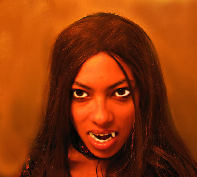
I hope nobody can tell this is me...I used halloween vampire teeth, which I lost while taking the photo and it took me 30 minutes to find them again. Its a little soft but we'll see.
****DQ'ed, barf! Lesson learned, I hope. |
| Disqualification Details |
| Cloning, dodging, burning, etc. to improve your photo or remove imperfections or minor distracting elements, etc. is acceptable. However, using any editing tools to duplicate, create, or move major elements of your photograph is not permitted. |
| Author | Thread |
|
|
05/15/2006 06:23:44 AM |
| well i got DQ'ed for improving my background. I didnt think it would be a problem, but I was wrong. My score was a 5.1, which was pretty generous considering the photo was so out of focus. |
|
Comments Made During the Challenge  |
|
|
05/11/2006 06:26:08 PM |
Poster shaped crop would make this better...
TC |
|
 Photographer found comment helpful. Photographer found comment helpful. |
|
|
05/11/2006 11:53:17 AM |
| Very eeerie shot, i think I'd like this film. |
|
| Photographer found comment helpful. |
|
|
05/10/2006 11:37:15 AM |
| More like a painting than a photograph, eye-whites are very unrealistic. |
|
| Photographer found comment helpful. |
|
|
05/09/2006 01:29:21 PM |
| The image works as an ad for a movie for me but to be honest, I've never seen a square poster. With the right crop, this would have really stood out... :) |
|
| Photographer found comment helpful. |
|
|
05/09/2006 12:04:32 PM |
|
| Photographer found comment helpful. |
|
|
05/09/2006 11:35:27 AM |
| a blaxploitation horror movie from the 70s! I am so there. I would suggest cropping the right and putting text on the left. Good picture, and great work from your model. What fabulous eyes she has! (the better to eat you with) |
|
| Photographer found comment helpful. |
|
|
05/09/2006 02:24:58 AM |
| Like the idea a lot, but I feel that you blurred or used NI too much, sorry. |
|
| Photographer found comment helpful. |
|
|
05/08/2006 10:11:55 PM |
| Shot is great and the mouth, lips & teeth are very well done, great emphasis, eyes I'm afraid let it down for me. Well done though |
|
| Photographer found comment helpful. |
|
|
05/08/2006 09:42:21 PM |
|
| Photographer found comment helpful. |
|
|
05/08/2006 08:56:24 AM |
| This would have been so much better without the heavy noise reduction. the colors give a creepy feel to this, which you obviously intended. Background's fine. Very white eyes contribute too. But noise reduction artifacts bother me. |
|
| Photographer found comment helpful. |
|
|
05/07/2006 10:31:41 PM |
| great title and finally a good refresing idea. |
|
| Photographer found comment helpful. |
|
|
05/07/2006 09:55:13 PM |
| the image seems to have too much blur or neat image applied. Not crazy about the lack of sharp focus or details in the skin. |
|
| Photographer found comment helpful. |
Home -
Challenges -
Community -
League -
Photos -
Cameras -
Lenses -
Learn -
Help -
Terms of Use -
Privacy -
Top ^
DPChallenge, and website content and design, Copyright © 2001-2025 Challenging Technologies, LLC.
All digital photo copyrights belong to the photographers and may not be used without permission.
Current Server Time: 04/07/2025 01:34:04 AM EDT.