| Author | Thread |
Comments Made During the Challenge  |
|
|
08/10/2003 07:03:37 AM |
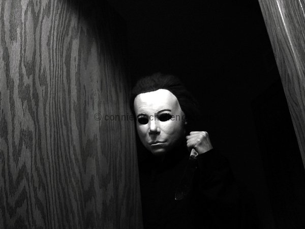
| Horror movies rock. This is a very good picture. black and white really works for this one well. Nice job! |
|
|
|
08/10/2003 06:23:24 AM |
I love this shot, excellent use of light and shadow to bring across the feelings from the film, I also like the detail from the wood grain (nice choice of setting, gives it more feeling). Nice sharp focus, a little more definition from the blade would have made this shot even better, good work - 9
EDIT - spelling mistake
Message edited by author 2003-08-11 06:34:02. |
|
 Photographer found comment helpful. Photographer found comment helpful. |
|
|
08/07/2003 11:42:04 PM |
|
|
|
08/07/2003 09:45:58 PM |
| Pleasantly spooky. Well done. |
|
| Photographer found comment helpful. |
|
|
08/07/2003 07:59:52 PM |
| a good composition and use of grayscale..a little more light on the blade of the knife would add to the menacing feel of the photo.(7) |
|
| Photographer found comment helpful. |
|
|
08/07/2003 06:59:48 PM |
| I hope this isnt photoshop!!!! You couldnt have done better. (10) |
|
|
|
08/07/2003 06:59:15 PM |
| Good picture! Nice contrast and it captures the mood! |
|
| Photographer found comment helpful. |
|
|
08/07/2003 01:45:29 PM |
|
|
|
08/07/2003 10:34:29 AM |
| Aaaaaaaaaaaagh! Nice dramatic lighting, though I wish I could see more of the knife. Great composition. |
|
| Photographer found comment helpful. |
|
|
08/07/2003 06:43:28 AM |
| A shinier dagger would have been better. It almost gets lost in the darkness here. |
|
| Photographer found comment helpful. |
|
|
08/07/2003 02:14:55 AM |
| Damn I'm getting to hell outta here. Beautiful pic. I like how you see Mike's head, hand and barely the knife. WoW. Thank you for using B&W. I don't think color would have gave the same mood. |
|
| Photographer found comment helpful. |
|
|
08/06/2003 10:48:24 PM |
Very real and fits the topic. Just the right amount of lighting in my opinion.
Congrats on a job well done. You are in my top 3 picks. |
|
| Photographer found comment helpful. |
|
|
08/06/2003 02:53:07 PM |
| my favorite of this challenge, well done |
|
| Photographer found comment helpful. |
|
|
08/06/2003 07:28:37 AM |
| A bit too centered and a bit too much wood on the left, but still a good photo. 9 |
|
| Photographer found comment helpful. |
|
|
08/06/2003 01:17:57 AM |
| Great idea using the "Jason" mask. :) But you should have illuminated the knife more and probably should have shown him comming down the stairs with the knife low and off to the side (remember?). |
|
|
|
08/05/2003 07:57:32 PM |
| Pretty good - but would have been fabulous if the knife had a larger highlight...plus the Halloween guy looks more like the Phantom of the Opera guy :-) |
|
|
|
08/05/2003 05:14:27 PM |
| Emotional...dark and scary...on target. Only suggestion would be less space on the left and closer on the mask subject. Great lighting! |
|
|
|
08/05/2003 10:19:01 AM |
| This is very cool I like the setup of this and the darkness in it. mabey the knife could have been seen better? |
|
|
|
08/04/2003 03:37:53 PM |
| Seeing that face is bringing back bad memories already. Good job with the lighting on the face and hand but the knife is a bit dark. - 9 |
|
| Photographer found comment helpful. |
|
|
08/04/2003 03:12:15 PM |
|
|
|
08/04/2003 03:11:05 PM |
| LOL very good. My computer is set darker I guess because I can't see the knife except for the handle. |
|
|
|
08/04/2003 02:28:58 PM |
| Well done, i hate this movie, but you did it real good :) 9 |
|
| Photographer found comment helpful. |
|
|
08/04/2003 07:09:05 AM |
| very clean well focused image. black and white is excellent as is the lighting. 7 |
|
| Photographer found comment helpful. |
Home -
Challenges -
Community -
League -
Photos -
Cameras -
Lenses -
Learn -
Help -
Terms of Use -
Privacy -
Top ^
DPChallenge, and website content and design, Copyright © 2001-2026 Challenging Technologies, LLC.
All digital photo copyrights belong to the photographers and may not be used without permission.
Current Server Time: 02/01/2026 10:24:31 AM EST.