| Author | Thread |
|
|
07/30/2003 04:02:37 AM |
| i thought thius was an awesome stylised poster effect. |
|
 Photographer found comment helpful. Photographer found comment helpful. |
Comments Made During the Challenge  |
|
|
07/29/2003 05:58:36 PM |
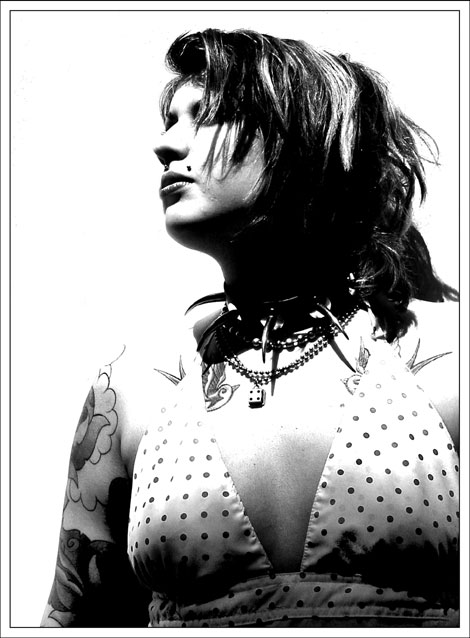
| Nice photo. Would have loved to have seen it in color, but b&w looks nice as well. Only thing I'm not too fond of is her shoulders disappearing into the background. Otherwise, good job. |
|
| Photographer found comment helpful. |
|
|
07/29/2003 04:15:29 PM |
|
|
|
07/29/2003 02:41:16 PM |
I like the high contrast you used
and the shot works perfect in b&w :)
well done ! |
|
| Photographer found comment helpful. |
|
|
07/29/2003 01:55:47 PM |
| Great shot - excellent lighting & contrast - good pose - neat composition. Top job. [10] |
|
| Photographer found comment helpful. |
|
|
07/28/2003 08:45:46 AM |
| you should make her tats and studs more central, rather than her unadorned chest. |
|
|
|
07/27/2003 02:57:00 AM |
| Very good image. I like the raw feel of the shot - the hard, contrasty lighting and the subject's turned head and hidden eyes. well done |
|
| Photographer found comment helpful. |
|
|
07/25/2003 03:23:13 PM |
| I like the black and white on this one. Its good, keep it up. |
|
|
|
07/25/2003 09:02:21 AM |
| A bit over exposed on the face, but this was obviously intentional, and, I think, effective. Somehow the shirt (?) seems a little out of place on this girl. |
|
|
|
07/23/2003 08:43:24 PM |
| It's a good picture. But I find it a little to bright up top, and to dark below. Would have been nice to see her tattoo's, and necklaces a bit better. Her necklaces seem to dark for the most part, and her tattoo's seem a bit covered up. But it's all good =) |
|
| Photographer found comment helpful. |
|
|
07/23/2003 05:58:00 PM |
| Nice stylish shot. I like the contrast and the highlights and shadows are excellent. Only nitpick I have is that the lighting combined with the levels/contrast adjustments make her shoulders disappear. I think it would be nice to see at least some differentiation from the background. You didn't beat me over the head with the trend aspect either, which is good for a shot like this. |
|
| Photographer found comment helpful. |
|
|
07/23/2003 05:55:04 PM |
|
|
|
07/23/2003 04:57:31 AM |
| My only 10 this week.. I love the power of this image, only slight niggle would be the tops of the shoulders are lost into the background, it would have been nice to see some definition here. Your model carries the look off very well.. |
|
| Photographer found comment helpful. |
Home -
Challenges -
Community -
League -
Photos -
Cameras -
Lenses -
Learn -
Help -
Terms of Use -
Privacy -
Top ^
DPChallenge, and website content and design, Copyright © 2001-2025 Challenging Technologies, LLC.
All digital photo copyrights belong to the photographers and may not be used without permission.
Current Server Time: 04/07/2025 01:04:36 PM EDT.