| Author | Thread |
Comments Made During the Challenge  |
|
|
07/19/2003 03:25:38 PM |
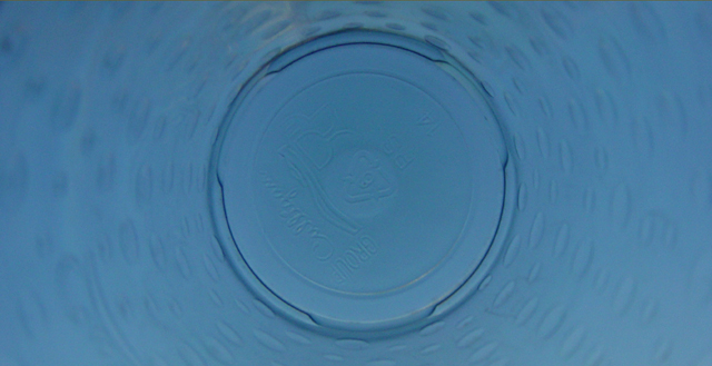
| Hey, Culligan Man! ;-) A more sqare crop would have worked better to accentuate "round" to me. And while I joked about the Culligan logo, the writing at the bottom is a bit of a distraction. But I like the color, the focus is well enough on the bottom of the bottle, the dimples or droplets are a nice effect, and the DOF works well. |
|
 Photographer found comment helpful. Photographer found comment helpful. |
|
|
07/18/2003 03:44:28 PM |
| Interesting perspective. Nothing grabs my attention in this shot however. |
|
| Photographer found comment helpful. |
|
|
07/16/2003 10:51:02 PM |
1)Does the shot fit the Challenge? I would say yes (5)
2)Photo Color: Color is decent(5)
3)Composition: I think the composition is a little week here. (4)
4)Focus: Focus on the Focal point seems to be good.(6)
5)Background. (4)
6)Lighting. Lighting is what really hurt you. (3)
Conclusion:
I think the biggest issue with this shot is the lighting. I think a bit more light at would allow for you to read the bottom of the water Jug. I do however think that you had an idea here. It could have been executed a little better in my oppinion.
Overall Score: 4.5 Rounded to 5.0
John (TurboTech) |
|
| Photographer found comment helpful. |
Home -
Challenges -
Community -
League -
Photos -
Cameras -
Lenses -
Learn -
Help -
Terms of Use -
Privacy -
Top ^
DPChallenge, and website content and design, Copyright © 2001-2025 Challenging Technologies, LLC.
All digital photo copyrights belong to the photographers and may not be used without permission.
Current Server Time: 04/06/2025 10:42:06 PM EDT.