| Author | Thread |
Comments Made During the Challenge  |
|
|
07/26/2003 02:29:35 PM |
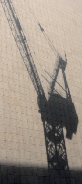
| Sillhouette capture was a good choice here. |
|
 Photographer found comment helpful. Photographer found comment helpful. |
|
|
07/24/2003 11:25:35 PM |
| Cropping off the shadow at the bottom may have made the crane's shadow stand out even more, perhaps. Overall, the shot is a bit "flat" to me. |
|
| Photographer found comment helpful. |
|
|
07/23/2003 06:57:27 PM |
| I am trying to comment on all the shots this time, this one is hard, to be honest I did not score it too high, but I think in fairness I need to tell you why. I think it is nothing screams out at me of interest, the shadow itself I think needs to pushed more-- i.e. darkened or more contrast to make the image stronger. I also don't think the bottom shadow does much but to distract from the more interesting crane part. keep up the efforts. (just my opinion) |
|
| Photographer found comment helpful. |
|
|
07/21/2003 08:14:16 PM |
| would have liked to have seen the image of the crane darker against the building. The image is very grey and grainy.. |
|
|
|
07/21/2003 10:03:10 AM |
| Could almost be Kertesz - fabulous shot. Can't mentally twist it enough to fitt tthe challenge though: there seems to be only one element here. |
|
|
|
07/21/2003 06:42:15 AM |
| contrast not too sharp a difference |
|
Home -
Challenges -
Community -
League -
Photos -
Cameras -
Lenses -
Learn -
Help -
Terms of Use -
Privacy -
Top ^
DPChallenge, and website content and design, Copyright © 2001-2026 Challenging Technologies, LLC.
All digital photo copyrights belong to the photographers and may not be used without permission.
Current Server Time: 02/01/2026 07:50:58 AM EST.