| Author | Thread |
Comments Made During the Challenge  |
|
|
01/23/2006 05:46:15 PM |
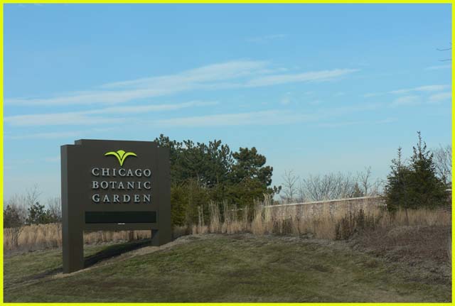
| Sign is fine, but it would be nice to see some of the garden as well. Picture is somewhat flat. |
|
|
|
01/23/2006 04:26:18 AM |
| Nice photo, border is very distracting...(7) |
|
|
|
01/22/2006 10:29:20 AM |
| its a sign, but no story with it |
|
|
|
01/22/2006 07:09:17 AM |
|
|
|
01/21/2006 10:48:12 PM |
| The yellow frame really does not enhance this image at all, it is simply distracting. |
|
|
|
01/21/2006 06:36:31 AM |
| The border is a bit distracting. |
|
|
|
01/20/2006 03:57:45 PM |
| It's an ok sign, but not very dynamic I'm afraid. The yellow border competes for attention - something a border should not do. |
|
|
|
01/20/2006 09:34:53 AM |
| The image feels flat, with a bit of hazyness and not enough contrast elements. |
|
|
|
01/20/2006 12:53:52 AM |
| I suggest to add contrast and saturation for improvement |
|
|
|
01/19/2006 04:57:15 AM |
|
|
|
01/18/2006 11:51:07 AM |
| Beautiful place, image needs a little more to match. How about punching up the green as well? Wishing for a sign in one of the gardens inside. |
|
|
|
01/18/2006 11:06:48 AM |
| I think the border is to distracting. It draws my attention away from the image, instead of keeping it on the image. |
|
|
|
01/18/2006 05:11:29 AM |
| I have a big issue with the color of your border as it becomes the main subject to me. |
|
|
|
01/17/2006 10:00:05 PM |
| The Border weirds me out. Just my 2 censt |
|
|
|
01/17/2006 08:47:11 PM |
|
Home -
Challenges -
Community -
League -
Photos -
Cameras -
Lenses -
Learn -
Help -
Terms of Use -
Privacy -
Top ^
DPChallenge, and website content and design, Copyright © 2001-2025 Challenging Technologies, LLC.
All digital photo copyrights belong to the photographers and may not be used without permission.
Current Server Time: 04/07/2025 01:31:53 AM EDT.