| Author | Thread |
|
|
01/02/2006 05:24:31 PM |
Greetings from the Critique Club! :)
Composition
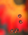
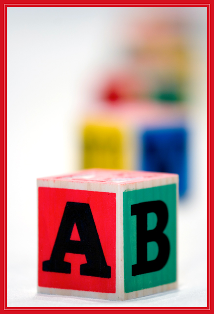
I love this shot, I've got to admit. I love the progression of the blur, I love the foreground colors, and I love the idea. I don't think you followed any compositional "rules", but the general feel of the image is very nice. The focus of the is very definitely where it belongs.
Camera Work
I honestly think this might have scored a bit higher if your DOF was a bit more forgiving. I see comments about the "softness" (perhaps made by someone misunderstanding "DOF", I don't know) and can only connect that with the A and B having slightly soft edges on the left and right. Focusing just a bit deeper on the letters would POSSIBLY have rendered them completely in focus by using the entire focus plane. As well, a slightly smaller aperture would have still given the same overall effect while imcreasing the sharpness of the letters A and B.
Post Processing
Incredibly well done. Color balance is perfect, contrast is very good, and the overall result is very pleasing. I even personally like the border, but I think it cost you quite a bit of score, as they usually do :)
My Thoughts
I did not vote on this challenge, but I would have probably rated this image an 8. I like the use of red, and I like the overall color. I also like the high key background.
Overall, an excellent image. Thanks for participating. I hope my thoughts have been helpful and informative. Please feel free to contact me by PM if you have any questions or responses.
Bernard |
|
 Photographer found comment helpful. Photographer found comment helpful. |
|
|
12/28/2005 03:19:03 AM |
|
Comments Made During the Challenge  |
|
|
12/27/2005 07:10:13 PM |
| Nice picture but the border is too distracting. |
|
| Photographer found comment helpful. |
|
|
12/27/2005 06:36:15 PM |
| the border seems too heavy for the image.. 6 |
|
| Photographer found comment helpful. |
|
|
12/27/2005 06:08:18 AM |
| Great job. For me this is the best here :-) |
|
| Photographer found comment helpful. |
|
|
12/22/2005 04:25:04 PM |
| Very nice design. I really dislike the busy red border though. |
|
| Photographer found comment helpful. |
|
|
12/22/2005 02:25:14 PM |
| Very simple, but still one of my favorites. 10 |
|
|
|
12/21/2005 10:25:24 PM |
|
|
|
12/21/2005 09:22:23 PM |
| Good idea and composition, just wish for better sharpness / focus. |
|
| Photographer found comment helpful. |
|
|
12/21/2005 06:50:00 PM |
Good pic, I had a similar one.... Should have dropped the ugly border though....
Another thing that could be better made is to maybe focus on the second item :)
Well just a couple of points, people tend to send only good picture comments. |
|
| Photographer found comment helpful. |
|
|
12/21/2005 12:02:49 PM |
|
|
|
12/21/2005 08:24:14 AM |
| love the composition and colours in this photo. the lighting's great!! |
|
| Photographer found comment helpful. |
|
|
12/21/2005 05:14:07 AM |
| Nice shot, great colors, I am not sure though about the red frame, a tad too aggressive to my taste (7) |
|
| Photographer found comment helpful. |
|
|
12/21/2005 02:48:53 AM |
| Good focus although a bit soft. The colors are fantastic against the white. However, the frame is very distracting. 6 from me. This would have been an easy 8 if not for the frame. |
|
| Photographer found comment helpful. |
Home -
Challenges -
Community -
League -
Photos -
Cameras -
Lenses -
Learn -
Help -
Terms of Use -
Privacy -
Top ^
DPChallenge, and website content and design, Copyright © 2001-2026 Challenging Technologies, LLC.
All digital photo copyrights belong to the photographers and may not be used without permission.
Current Server Time: 02/01/2026 11:12:29 AM EST.