| Author | Thread |
|
|
11/07/2005 02:37:35 PM |
Greetings from the Critique Club:
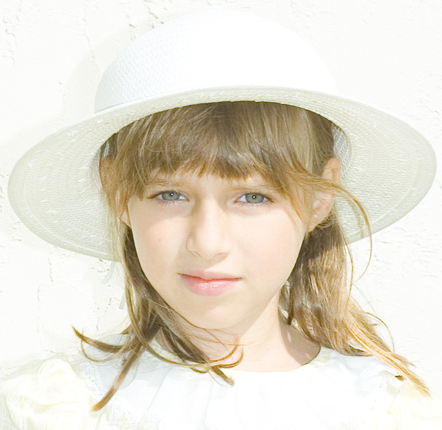
Whiter Shades of Pale was your entry for the Light On White II challenge and it fits perfectly.
Technical:
You have not added any information on the processing steps you used so I will have to try and work out what you did. This info is extremely useful for other photogs who want to try to replicate your technique, and it helps when doing a critique. Excellent use of the permitted maximum size, the square format works really well. Cropping is really tight, but very accurate, almost as if you have measured to make sure it is equal all round. I am guessing that you had natural sidelighting or perhaps a reflector and you either used fill flash or another reflector to achieve your facial lighting. The flash highlights in the eyes is a nice touch. It looks as if you have used USM, not too much though and either adjusted brightness or used curves to get the airy/dreamy look. By doing this you have given the shadows are grey look. This works better than having harsh dark shadows.
Composition:
The very tight crop has worked well as has the white wall as a background. It is a shame that Jess? found it just a bit bright and hence is squinting a bit. I like the angle of the hat and the shadow it casts on her face.
Overall:
I noted that some commentors thought the face was a bit on the bright side, I disagree, Jess? has such a wondeful complexion that the light works well. Her hair looks really natural, I am glad you resisted the temptation to make it neat and tidy. There are a couple of things I do not particularly like, the overbrightness on the hat has taken out some of the detail as it has on her dress, these would have caused me to mark slightly lower, but I think this image deserved more than 5.35 IMO. A very competent image, one to be proud of and a pleasure to critique, thanks!
Steve |
|
Comments Made During the Challenge  |
|
|
11/01/2005 04:45:23 PM |
| I love the over exposed look and how it looks like she is staring into a light. Awesome shot. |
|
|
|
10/30/2005 04:38:44 PM |
| The photographer was able to have every aspect of the challenge work. The pale image of the subject against the white background works so well that is very distinguishable yet is part of the whole. Well done! |
|
 Photographer found comment helpful. Photographer found comment helpful. |
|
|
10/30/2005 08:28:52 AM |
| Your subject is very pretty. I love her hat and expression. The shadows from the hat on the backdrop and on her face are somewhat distracting. She should have been placed further from the backdrop and more lighting used on the backdrop. Also, a fill flash for her face. Not every capture has to be perfect, though. I really like this as is. |
|
| Photographer found comment helpful. |
|
|
10/29/2005 08:56:58 PM |
| I feel this works for sure. Everything about it says bright, but then the eyes hold your attention more than the obvious "blown out" parts do. I hope you didn't get too many comments about the blowouts because that just annoys me sometimes. |
|
| Photographer found comment helpful. |
|
|
10/29/2005 12:14:16 AM |
| Perfectly meets the challenge with a perfect little lady. Good luck. 9 |
|
| Photographer found comment helpful. |
|
|
10/28/2005 01:58:38 PM |
| This is a very nice portrait, however the hats shadow on the wall shows up as bad dirty smudges at first glance. This may cause the loss of some points. Good luck, I think this could have been a top 5 finish. Backgrounds can make or ruin a photo. |
|
| Photographer found comment helpful. |
|
|
10/27/2005 08:23:17 PM |
| Nicely captured and perfect for this challenge... very well done... :) |
|
| Photographer found comment helpful. |
|
|
10/27/2005 02:33:45 PM |
Great entry. Very subtile details are still there. for the most part.
Her expression is enigmatic, she must be a real trooper, because I can can almost hear that "Ah, Dad (or Mom), when are we going to be done?" |
|
| Photographer found comment helpful. |
|
|
10/27/2005 11:33:46 AM |
| A bit too much light on parts of her face - looks just a tad overexposed. It might have worked better to go with less exposure and bring out the whites with curves in the post processing. |
|
| Photographer found comment helpful. |
|
|
10/26/2005 10:17:54 AM |
| I like the sense of portraiture. The pale seems a tad forced, like you reduced some of the contrast. She's beautiful. I wish she weren't squinting. Her eyes are lovely and I like that her hair is falling in wisps, not all perfectly brushed and groomed. 7 |
|
| Photographer found comment helpful. |
|
|
10/26/2005 08:53:32 AM |
|
| Photographer found comment helpful. |
|
|
10/26/2005 02:11:28 AM |
|
| Photographer found comment helpful. |
Home -
Challenges -
Community -
League -
Photos -
Cameras -
Lenses -
Learn -
Help -
Terms of Use -
Privacy -
Top ^
DPChallenge, and website content and design, Copyright © 2001-2026 Challenging Technologies, LLC.
All digital photo copyrights belong to the photographers and may not be used without permission.
Current Server Time: 02/01/2026 09:53:38 AM EST.