| Author | Thread |
Comments Made During the Challenge  |
|
|
06/20/2003 12:49:30 PM |
|
|
|
06/19/2003 11:43:32 AM |
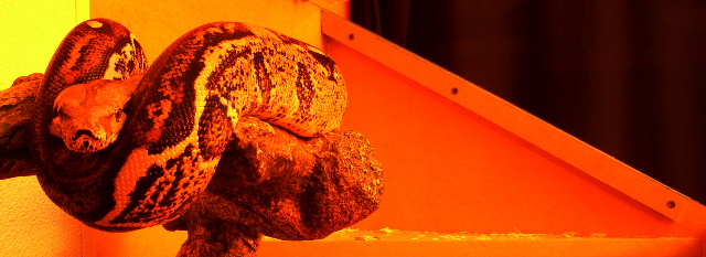
| Nice idea, but the snake does not look quite in focus. The colours of the background IMO take away from the snake. Also, the triangular shape to the right competes for attention with the snake. ~4 |
|
|
|
06/19/2003 01:48:09 AM |
| This one seems a little to red toned for my tastes. I'd have liked to seen it more natural in color. |
|
|
|
06/16/2003 05:43:05 PM |
| A bit too orange, I think. |
|
|
|
06/16/2003 05:25:33 PM |
| Too much red, and maybe if the background was a single color it could have made it better. 5 |
|
|
|
06/16/2003 10:07:56 AM |
| The exposure's bright enough that the definition on his head is completely shot, making it hard to find somewhere to look that isn't either the curve of his body or the slanting line with screw-holes in it, neither of which are wonderfully appealing subjects, aesthetically. |
|
|
|
06/16/2003 09:16:30 AM |
| Seems just a bit *too* red for my tastes, even though that appears to be intentional. |
|
|
|
06/16/2003 01:16:06 AM |
| radical lighting. cool snake, and name. |
|
|
|
06/15/2003 10:19:19 PM |
|
|
|
06/15/2003 08:33:42 PM |
| I'd like it if the snake's head were more of a focal point, rather than the middle of his body (shifting the composition a bit to the left would have accomplished this). |
|
Home -
Challenges -
Community -
League -
Photos -
Cameras -
Lenses -
Learn -
Help -
Terms of Use -
Privacy -
Top ^
DPChallenge, and website content and design, Copyright © 2001-2025 Challenging Technologies, LLC.
All digital photo copyrights belong to the photographers and may not be used without permission.
Current Server Time: 04/07/2025 12:50:24 PM EDT.