| Author | Thread |
|
|
12/20/2005 08:09:16 AM |
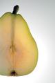
| I disagree that this should have been centered. It would look as though it is just plopped right down in the center of white space, where as this gives it an artistic quality. Good use of the rule of thirds. |
|
 Photographer found comment helpful. Photographer found comment helpful. |
Comments Made During the Challenge  |
|
|
10/29/2005 09:10:20 AM |
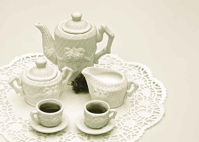
| The tea and the parsley(?) helps give it a bit of pinache. I like the lacy texture of the doily and the teaset. I might have cropped it below the end of the doily in the foreground. Clear and nicely detailed. 7 |
|
| Photographer found comment helpful. |
|
|
10/27/2005 06:22:08 PM |
| Awesome...must be green tea. |
|
| Photographer found comment helpful. |
|
|
10/27/2005 05:56:03 PM |
| This is a nice set up and good coloring. I understand the desire to avoid a bullseyed composition but this one feels kind of strange...like the items slid out of the frame while you were taking the shot. I think a more centered composition would have worked better here. |
|
| Photographer found comment helpful. |
|
|
10/27/2005 05:42:34 PM |
| How soft and delicate. Your lighting is very nice. 8 |
|
| Photographer found comment helpful. |
|
|
10/27/2005 12:15:14 PM |
| Great tones but why is everything shoved over to the left like that? |
|
| Photographer found comment helpful. |
|
|
10/26/2005 04:28:37 PM |
| it would be better if the photo was centered,or at least cropped a little more on the right.otherwise it's good. |
|
| Photographer found comment helpful. |
Home -
Challenges -
Community -
League -
Photos -
Cameras -
Lenses -
Learn -
Help -
Terms of Use -
Privacy -
Top ^
DPChallenge, and website content and design, Copyright © 2001-2026 Challenging Technologies, LLC.
All digital photo copyrights belong to the photographers and may not be used without permission.
Current Server Time: 02/01/2026 09:43:58 AM EST.