*Critique Club*
First of all does it fit the challenge? I'm not really sure... I didn't vote on this challenge because I had no real boundaries for what I was looking for, so yeah... I can't really say on that one. But if that's his "what" look... then I guess it does.
Now on to the real stuff...
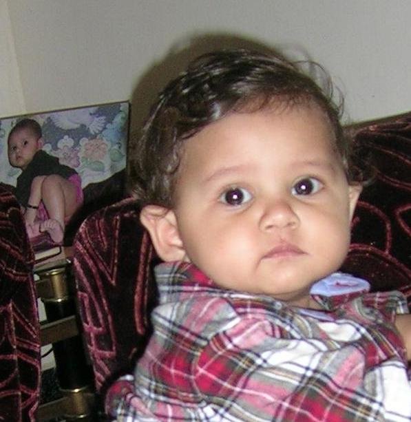
I sort of like the composition... especially with the other photo (of him?) to the left and behind him... it's a very interesting play between the two. The only thing I might suggest would be cropping down a little, as that extra blank space at the top isn't really needed, and doesn't add anything to this image.
I think something that really would have boosted your score here would have been focus. Unfortunately you just didn't focus in the right place for the image - meaning your son. When you are doing portraits usually the sharpest item in the photo should be the eyes. After that it's your choice how clear or unclear the rest of the image is, but if you are shooting a person, the eyes go a long way for a good portrait. I understand that this can be difficult when you are shooting a candid, as you seem to have been here. One idea is to try and prefocus in the spot where you are pretty sure the eyes will be... This can be more difficult unfortunately with a point and shoot, but play around with the settings on the camera.
Another issue I have is the extreme shadow on the wall, most likely caused by flash or harsh lighting... if you can avoid that it's always best... although it's a little more difficult with a p&s. also while most of the image looks pretty well exposed, your son seems to be just a bit blown out, especially the whites on his shirt and his face... try lowering the flash if possible, and if not using some layers of tissue over it to soften the harshness.
You've got an adorable subject!! Keep shooting and above all have fun!
-Talya
|