| Author | Thread |
|
|
06/22/2003 04:25:26 AM |
Greetings from the Critique Club
By Inspzil
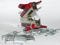
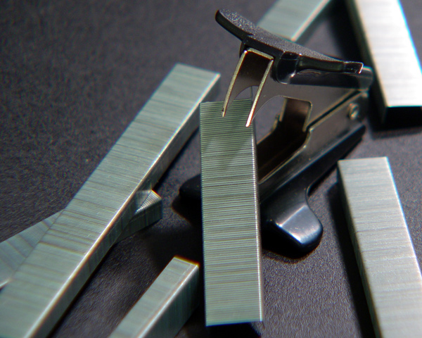
Composition - I think your staple puller does look like something predatory - a saber tooth staple puller. I like the general idea. But I think I would've shredded some of the staples to make it look like scraps left at a kill site. Maybe broken the one it's biting too. The concept is pretty good. Needs just that little bit of refining. Maybe break a couple of them smaller so they look like staple offspring. A less reflective background might have helped too.
Technical - You need more light so you can stop up to F-8 or so. That would provide you with focus on more of the frame. The focus here is just a touch soft too. It could use just a little more focus. The exposure is good as it is. The goal is to get this exposure, but with the F-stop set much higher.
Overall - I think with minor adjustments, you could've maximized the potential of this picture. I don't think it's a bad shot. The biggest factor for why this rated where it did is focus. If it was pin sharp, it would've done better. My personal opinion on it is look at it in ACDSee (if you have it. If you don't, get it!) I generally look thru all my images at "fit to screen" size. When I see a pic that I might use, I blow it up to 70%. If it is sharp at 70%, then I will consider using it. If not, then go on to the next one. When I resize, I always hit sharpen one time in PS. With the background you used, that might not work as it will make it look sparkley. There's you nickels worth of free advice. Forgive me if I left any hanging prepositons - Good luck in future challenges - Bob |
|
Comments Made During the Challenge  |
|
|
06/15/2003 01:30:36 AM |
| Its good but it wouldve look better if some of the staples had been broken to indicate that the de-stapler actually "killed" something. 5 |
|
|
|
06/13/2003 08:39:16 PM |
| A similar idea to mine; your's is less busy and more "pointed." |
|
|
|
06/12/2003 10:02:38 AM |
| Cute concept, but the picture itself isn't all that appealing. Take a look at the other picture with a staple remover in it for a more compelling (and predatory) set of posing and composition. |
|
|
|
06/11/2003 01:32:32 PM |
| Aaarrgghh! Violence! It's too horrible! |
|
|
|
06/11/2003 05:47:50 AM |
|
|
|
06/10/2003 05:00:52 PM |
| I can't quite see the art of it. |
|
|
|
06/09/2003 09:24:24 AM |
Howdee,
This is a fine image that is technically fine. There are no obvious flaws or distractions. I feel that it lacks something that captures the viewers attention. The lines of the staples are competeing with the staple remover. This keeps the eye bouncing around the screen trying to find a central object to focus on. The background although not distracting doesn't add any feel to this shot. There is no color to add drama. Some red underneath would have given the viewer the feeling of the attack. That coupled with maybe just the one row of staples with a different camera angle would have pulled this all together for a stronger image. -danny |
|
|
|
06/09/2003 09:17:44 AM |
| Excellent title, excellent concept, relly brings out the fang qualities of the staple remover... perhaps if you had some "carcases" of staples you removed from somehting lying next to it? That might look pretty funky. My only gripe - A bit more of the whole set-up in focus would have been nice. Good luck with this one. Mitonski |
|
|
|
06/09/2003 07:14:34 AM |
| This is by far the best concept in the whole challenge! Amusing, appropriate, and good composition. |
|
Home -
Challenges -
Community -
League -
Photos -
Cameras -
Lenses -
Learn -
Help -
Terms of Use -
Privacy -
Top ^
DPChallenge, and website content and design, Copyright © 2001-2025 Challenging Technologies, LLC.
All digital photo copyrights belong to the photographers and may not be used without permission.
Current Server Time: 04/07/2025 01:00:35 PM EDT.