| Author | Thread |
Comments Made During the Challenge  |
|
|
06/17/2003 03:53:07 PM |
|
|
|
06/17/2003 02:51:33 AM |
| Excellent, frustrating initially but it makes a closer look worthwhile. Not very much to fault here, from my viewpoint. |
|
|
|
06/16/2003 11:49:50 AM |
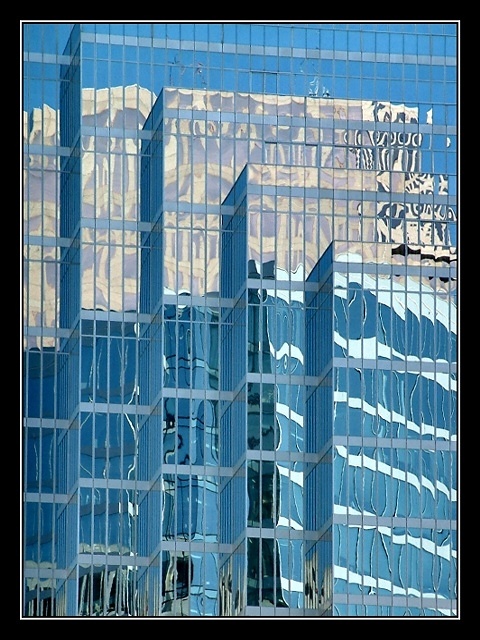
| Well this is certainly glass, and a well done photo. I do indeed want to pick up a copy and read about the various uses of glass, so well demonstrated by your photo! |
|
|
|
06/15/2003 11:55:21 AM |
| Suberb in every way! I can see this being chosen by them, did you try submitting it :) |
|
|
|
06/14/2003 07:25:55 AM |
| Great compostion, color, framing and content. The challenge is to creat an image worthy of your magazine, you acomplished that very well. |
|
|
|
06/14/2003 03:24:46 AM |
| And I thought my magazine was a popular choice at the newstands :) I could definitely see this on the cover. great reflections. |
|
|
|
06/13/2003 07:09:54 AM |
| would be good on an annual report cover too - The border feels a bit heavy - 8 |
|
|
|
06/13/2003 04:22:18 AM |
Can see the relationship between title and picture in this one :)
Nice picture. |
|
|
|
06/12/2003 09:31:13 PM |
| Never heard of this magazine. LOL "International Glass Review"?? |
|
|
|
06/12/2003 12:11:42 PM |
| This is a really nice shot. I like how you captured the building in the reflection of another covered in glass. |
|
|
|
06/12/2003 10:25:59 AM |
| WOW WEEEE.........what can I say....10 |
|
|
|
06/12/2003 06:07:35 AM |
Gorgeous shot. It could be a cover !
Very aestetic too. I like it very much. |
|
|
|
06/11/2003 12:56:46 PM |
| Hadn't heard of your magazine before this but it doesn't surprise me in the least an industry-specific magazine like this exists. The photo fits the topic. I think its possible the reflection in the building shows up a little TOO well, maybe because of how highly-lit it is, in terms of attractiveness of photo, though if that were the point of the article I suppose that would make sense. I just am not sure where a compositor would fit text easily. As an industry-style magazine photo it's fine even if I wouldn't exactly hang it on my wall. |
|
|
|
06/11/2003 11:47:06 AM |
| Cool... I could definitely see this on the front of a magazine of that name. I don't think that the border was necessary, I don't think most magazines have borders. This is an awesome building. Where's it located... Chicago? Nicely done... but almost too much border which ddetracts from the photo. Just my opinion though. |
|
|
|
06/11/2003 09:50:13 AM |
| What a great photo! Very interesting and I can easily see it as a covershot. |
|
Home -
Challenges -
Community -
League -
Photos -
Cameras -
Lenses -
Learn -
Help -
Terms of Use -
Privacy -
Top ^
DPChallenge, and website content and design, Copyright © 2001-2025 Challenging Technologies, LLC.
All digital photo copyrights belong to the photographers and may not be used without permission.
Current Server Time: 04/07/2025 02:53:03 AM EDT.