| Author | Thread |
|
|
06/10/2003 02:14:21 PM |
FROM THE CRITIQUE CLUB
Hello, Mona,
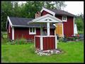
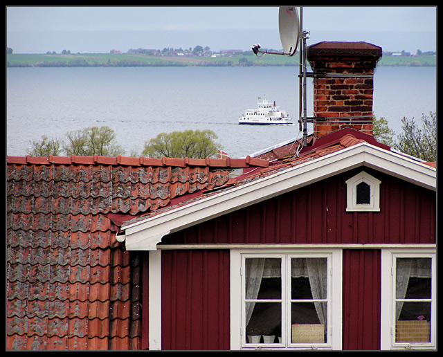
First impressions: Your entry to "Home Sweet Home" is very appropiate to the theme; when I look at it, I can think of home, not mine, but someone's home.
Composition: The ship in the background reinforces the idea of home (coming home), as does the pink flower in the right window and the lace courtains (being home); even the satellite dish :) speaks of home (things we do at home). I very much like that you show only the top part of the house. The simple grey/black frame is appropiate to the photo.
Focus: Focus is fine.
Light: OK, the colours of the house, in particular the chimney bricks and roof tiles, are beautiful, well saturated. The background, by contrast, is a bit washed out, especially the blues, (it must have been a hazy day?), and that hurts your picture. I don't know what post-processing software you have, but you probably could improve the image using one of the various tools available for contrast or colour improvement.
I hope this helps. I very much like the glowing light in your "Cloud-scape" picture - it's beautiful! Take care,
Ursula (uabresch)
Comments, questions, complaints ... feel free to contact me. |
|
 Photographer found comment helpful. Photographer found comment helpful. |
Comments Made During the Challenge  |
|
|
06/03/2003 04:46:55 PM |
| Great shot, just take down the satellite dish before taking the photo again :-) |
|
| Photographer found comment helpful. |
|
|
06/03/2003 01:42:23 PM |
| The texture of the roof adds depth to the photo. |
|
| Photographer found comment helpful. |
|
|
06/03/2003 01:20:05 PM |
| I like the composition but I feel that the satelite and boat ruin it just a little bit. Not too much though. |
|
| Photographer found comment helpful. |
|
|
06/02/2003 10:53:54 PM |
| I'm not sure why, but I really like the composition/framing on this one. It's the kind of shot I go for a lot (shapeswise), but rarely manage to get anything I like from. |
|
| Photographer found comment helpful. |
|
|
06/02/2003 08:23:30 PM |
| i like the cropping that you have done in this photo..the background is nice also |
|
| Photographer found comment helpful. |
|
|
05/31/2003 08:55:13 PM |
| I love the texture of the roof! |
|
| Photographer found comment helpful. |
|
|
05/29/2003 09:57:51 PM |
| Nice composition! I like the color of the house! |
|
| Photographer found comment helpful. |
|
|
05/29/2003 09:32:24 AM |
| To bad the dish is in your view, otherwise beautiful. |
|
| Photographer found comment helpful. |
|
|
05/28/2003 09:21:54 PM |
| Good! I like the idea of having house and the view together. Wish I lived there. |
|
| Photographer found comment helpful. |
|
|
05/28/2003 02:08:22 PM |
| The colors and saturation of the house is very vivid, but the background seems washed out in comparison - 7. |
|
| Photographer found comment helpful. |
|
|
05/28/2003 02:04:59 PM |
|
| Photographer found comment helpful. |
|
|
05/28/2003 11:42:26 AM |
| Great idea, nicely executed. |
|
| Photographer found comment helpful. |
Home -
Challenges -
Community -
League -
Photos -
Cameras -
Lenses -
Learn -
Help -
Terms of Use -
Privacy -
Top ^
DPChallenge, and website content and design, Copyright © 2001-2026 Challenging Technologies, LLC.
All digital photo copyrights belong to the photographers and may not be used without permission.
Current Server Time: 02/01/2026 08:28:49 AM EST.