| Author | Thread |
|
|
09/15/2005 09:41:05 AM |
*Critique Club*
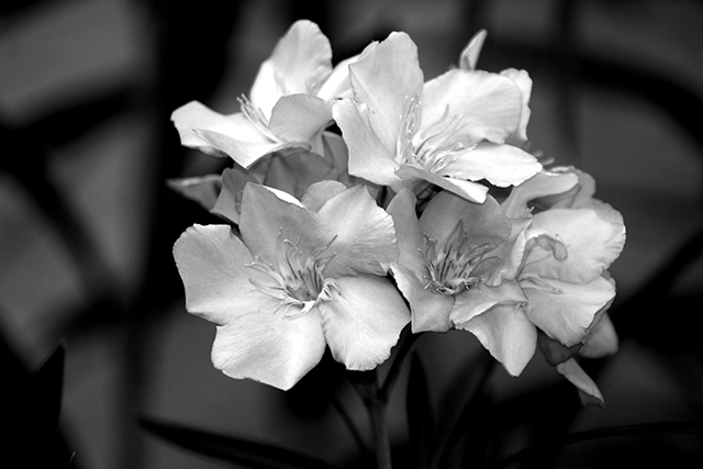
Hello Again. What really stands out to me in this shot is the focus and DOF. Very nice focus on the front flowers, fading into a DOF that not only provides something neat in the background, but also helps to prevent anything in the background from being distracting from the subject.
This is definately contrast. I'm thinking it might be on the border of being just contrast and high contrast though. There is enough bright areas in the background, to make the black seem like an afterthought, and the flowers themselves, while being white could definately be brighter to help add to the contrast. So while it's contrast, I think there is possibility to be higher contrast. If that makes sense.
I think someone else mentioned the placement of the flowers within the frame. They are a bit too centered for my taste as well. I'm thinking I'd like to see them maybe just a tad lower into the lower right corner and have a bit more of the background negative space showing toward the upper left area.
I think the black and white works well here.
~Heather~ |
|
 Photographer found comment helpful. Photographer found comment helpful. |
Comments Made During the Challenge  |
|
|
09/11/2005 06:02:07 PM |
| Beautiful crisp and clean picture. Excellent DOF. I feel as if I could reach out and physically touch the petals. Nice contrast. 9 |
|
| Photographer found comment helpful. |
|
|
09/11/2005 02:51:06 PM |
| Pretty shot...decent contrast. |
|
| Photographer found comment helpful. |
|
|
09/10/2005 04:16:27 PM |
| Pretty photo and nice shot, but lost a point for not enough dramatic effect. |
|
| Photographer found comment helpful. |
|
|
09/09/2005 06:28:32 PM |
| Wow - amazing focus & DOF. Great bokeh too. My only (very slight) criticism would be that although the bouquet (not bokeh - ;-)) is slightly offset, I think it could be moved more out of the center. This is a very strong entry. Bumping up. |
|
| Photographer found comment helpful. |
|
|
09/08/2005 08:51:41 PM |
| Certainly meets the challenge in my mind, and the way the flowers pop out from the darker background adds interest. I also like the fact that you didn't go for a flat, pitch black background. The shadows of the leaves/stems give some nice texture and pattern which boosts the interest factor. If I were to change some things I'd rather there was a little more luminocity to the white petals, its almost there but in my mind if the.. 'glowed' just a bit more then I think the "wow" would be a bit bigger. I gave a 6. |
|
| Photographer found comment helpful. |
|
|
09/07/2005 06:17:03 PM |
|
| Photographer found comment helpful. |
|
|
09/05/2005 02:36:07 PM |
| Excellent clarity and nice choice in DoF. <9> |
|
| Photographer found comment helpful. |
|
|
09/05/2005 10:52:21 AM |
| I like the contrast of the flowers with the stalks and background. |
|
| Photographer found comment helpful. |
|
|
09/05/2005 08:03:17 AM |
| very nice shot, good use of dop and contrast. though I'm afriad that there will be 6 million flower entries and overall you may get voted down due to that. I love it though 7 |
|
| Photographer found comment helpful. |
Home -
Challenges -
Community -
League -
Photos -
Cameras -
Lenses -
Learn -
Help -
Terms of Use -
Privacy -
Top ^
DPChallenge, and website content and design, Copyright © 2001-2025 Challenging Technologies, LLC.
All digital photo copyrights belong to the photographers and may not be used without permission.
Current Server Time: 04/08/2025 08:03:58 AM EDT.