| Author | Thread |
|
|
05/04/2006 02:03:04 PM |
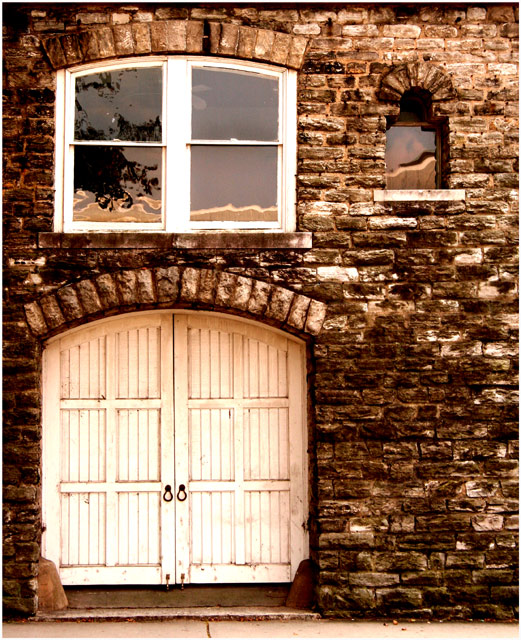
| Love the colors of this and the waterlike reflection off the glass. beautiful |
|
 Photographer found comment helpful. Photographer found comment helpful. |
|
|
03/27/2006 12:23:39 AM |
| love stuff like this. it would make for a nice series. |
|
| Photographer found comment helpful. |
Comments Made During the Challenge  |
|
|
09/11/2005 09:48:47 PM |
| love the tones and textures. great composition, too. |
|
| Photographer found comment helpful. |
|
|
09/11/2005 09:24:43 PM |
| Some nice areas of high contrast along the door and window. |
|
| Photographer found comment helpful. |
|
|
09/10/2005 02:16:49 PM |
| This is a particularly nice photo it's fairly basic but has a few elements to set it off and holds itslef nicely. Very nice shot. Good luck |
|
| Photographer found comment helpful. |
|
|
09/10/2005 02:59:34 AM |
| Very nice composition. It has nice interest and appeal. I like the tone you've used, I think it suits the image well. Good job. |
|
| Photographer found comment helpful. |
|
|
09/10/2005 01:33:59 AM |
| Great reflections in the windows, very well done. |
|
| Photographer found comment helpful. |
|
|
09/09/2005 09:23:45 PM |
| I don't get the title, but that's okay. I like the tones of the shot and the composition/crop. The focus is a hair off IMHO (not that every shot has to be tack sharp), but a solid entry. (pun intended!) ;-) |
|
| Photographer found comment helpful. |
|
|
09/08/2005 08:40:13 AM |
| Architectural shots are always appealing to me. I like the contrast of the brick with the wood and the coloration as well. The varying shapes of the windows and doors make for an interesting image. I like the reflection in the upper window too. The fact that it's not quite level with the bottom adds to its appeal. |
|
| Photographer found comment helpful. |
|
|
09/06/2005 05:49:01 PM |
This is obviously a nice old building full of texture and personality, but I feel that your composition is lacking something. The placement of the door and windows doesn't feel naturally balanced to me, and the elements themselves aren't compelling - don't seem to suggest a story to me. I can see voters giving this one a few seconds, clicking a midrange vote, and then moving on. What could you have done to make it compelling? I'd suggest focusing on a single element instead of the combination of the three. Maybe just the door, or even part of the door (metal knobs, etc.). The brickwork visible is very dark and of relatively low contrast, which detracts more from the raw visual appeal. Was the day cloudy? I don't see evidence of direct sun, which could have also added to the dramatic feel (shadows on textured surfaces like that are great). The addition of the sidewalk at the bottom is further unnecessary (IMO) picture elements in a composition that already feels crowded and disharmonious.
OK, what of the contrast asked for by the challenge topic? I'm afraid I really don't see it. The white woodwork against the darker brick just doesn't do it for me. There is some contrast implied in the reflections in the windows, but I think these work against you too. |
|
| Photographer found comment helpful. |
|
|
09/05/2005 05:28:39 PM |
| Simple, but effective. I like it. |
|
| Photographer found comment helpful. |
|
|
09/05/2005 10:11:41 AM |
| This is OK, but I think it might have been good to have some focal point as well - e.g. a person/pet/object/whatever, in the bottom right corner. I don't feel there's anything saying "Look at this first!" if you know what I mean. 5 |
|
| Photographer found comment helpful. |
Home -
Challenges -
Community -
League -
Photos -
Cameras -
Lenses -
Learn -
Help -
Terms of Use -
Privacy -
Top ^
DPChallenge, and website content and design, Copyright © 2001-2026 Challenging Technologies, LLC.
All digital photo copyrights belong to the photographers and may not be used without permission.
Current Server Time: 02/01/2026 09:33:14 AM EST.