| Author | Thread |
|
|
06/09/2003 09:39:36 PM |
*Critique Club*
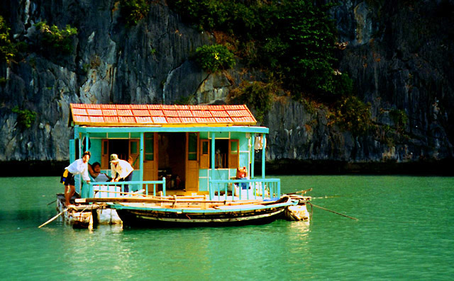
Wow what an attention getter. Really neat houseboat, I'm guessing it's homecrafted. The focus on the boat is very good and dof field centers on the main subject. Well done there.
The saturation is a bit heavy on the golds and greens and would improve the image if not so harsh.
It is nicely done and would love to see more of the unusualness of Vietnam lifestyles.
Anna |
|
Comments Made During the Challenge  |
|
|
06/03/2003 01:54:02 PM |
| now THAT would be cool!!! I assume you'd have no electricity there though. You wouldn't be able to browse DPChallenge...that's not much fun. LOL! The picture lacks some sharpness and detail but the colors are wonderful. |
|
|
|
06/03/2003 11:27:33 AM |
| Good photo, resolution may be hurting it on my computer, as the face of the guy is whited out. Otherwise looks good. |
|
|
|
06/03/2003 09:28:17 AM |
| Interesting photo. Seems a bit over saturated, the facial features aren't very distinct. 7 Swash |
|
|
|
06/02/2003 04:19:03 PM |
| now thats an awesome home! is this really yours? how do you get on the internet? :) |
|
|
|
06/02/2003 02:14:13 PM |
| cool shot. :) Unique house too. I think I would have liked to get just a shade closer to get some more details on the house and its inhabitants, but good shot, if not a bit bright on the house! |
|
|
|
06/02/2003 08:14:08 AM |
| Would have done well not to be over saturated. |
|
|
|
06/01/2003 09:32:13 PM |
|
|
|
06/01/2003 06:30:36 PM |
| fun shot, colorful houseboat!! |
|
|
|
05/31/2003 08:58:32 PM |
| Permanent home or weekend? Looks like a lot of fun. |
|
|
|
05/31/2003 10:28:38 AM |
|
|
|
05/30/2003 12:57:08 PM |
| With such stark contrast, it has a very magazine feel. Not too shabby. |
|
|
|
05/30/2003 12:53:32 PM |
| Slightly too much contrast, but a neat photo. |
|
|
|
05/29/2003 12:12:03 PM |
5. Fits the theme well enough, and there are no blatant 'you suck!' flaws to it, but neither does it really grab me for any reason at all. For reasons of composition, cropping, or subject choice, it's just a photo, and doesn't do especially much for me, aesthetically.
The colors are so luminously oversaturated, the lighting so harshly contrasting between 'bright on the barge' and 'black cliffs' (though I do like the colored lichen back there!), and the lack of good enough focus for the people to be more than impressionistic daubs, that it somehow fails to be about anything in particular. Good idea, though, and an interesting subject. |
|
|
|
05/28/2003 05:40:13 PM |
Blow up the offensive houseboat and you've got a potential shot!
Grossly overprocessed! An insult to nature and the senses. |
|
|
|
05/28/2003 04:00:20 PM |
| Love the colors and almost everything about this photo. My big problem is with the focus. |
|
|
|
05/28/2003 07:13:01 AM |
| A little over-saturated for my taste. 6 |
|
|
|
05/27/2003 10:36:53 PM |
|
Home -
Challenges -
Community -
League -
Photos -
Cameras -
Lenses -
Learn -
Help -
Terms of Use -
Privacy -
Top ^
DPChallenge, and website content and design, Copyright © 2001-2025 Challenging Technologies, LLC.
All digital photo copyrights belong to the photographers and may not be used without permission.
Current Server Time: 04/07/2025 12:54:50 PM EDT.