| Author | Thread |
|
|
05/27/2003 06:18:13 PM |
Greetings from the Critique Club!
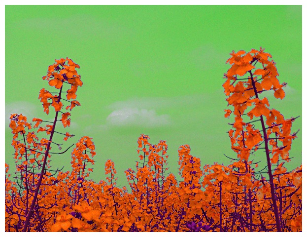
Stephan - I don't like the use of unnatural coloring to meet the challenge. I do like your composition and subject matter. I think that if the challenge is a color challenge, however, that you should endeavor to find the colors naturally. I think digital 'art' doesn't work as well on dpc - and that's what hurt your overall score.
You have done one of my 3 favorite shots on DPC (Edison's Gift) but this shot just doesn't draw us in the same way - it's cold and distant from the viewer - nothing we can relate to.
Happy shooting!
M |
|
 Photographer found comment helpful. Photographer found comment helpful. |
|
|
05/20/2003 08:21:21 PM |
Hohum... "cool but too digital"... Well, I admit I'm stretching the D in DPC ;-)
Regarding the jaggies: I uploaded a different version here which should have less problems with that.
cpanaioti: It's a hue shift of the colours. I changed each channel differently.
tomzinho: Special thanks for your funny comment :)
|
|
|
|
05/20/2003 08:03:36 PM |
|
Comments Made During the Challenge  |
|
|
05/17/2003 06:47:06 PM |
| if this didnt have weird jaggies, it would be even better. as it is, it's still neat |
|
| Photographer found comment helpful. |
|
|
05/15/2003 06:09:03 PM |
|
| Photographer found comment helpful. |
|
|
05/15/2003 02:54:30 PM |
very cool - okay frodo, take the ring off . . . now!
unfortunately it seems that the photo quality suffered in transference from that universe to ours, but the picture is striking enough that it still works just fine. |
|
| Photographer found comment helpful. |
|
|
05/15/2003 02:04:21 PM |
| fun hue shift. The clouds are the one anchor we have to reality, otherwise it would be too much! I enjoy looking at this. |
|
| Photographer found comment helpful. |
|
|
05/14/2003 07:22:56 PM |
| This looks like a painting. I'd be very interested in seeing how you did this. |
|
| Photographer found comment helpful. |
|
|
05/14/2003 11:58:51 AM |
| Wo. Very different. Nice mix of orange, green and purple. Good luck. Jacko. 6 |
|
| Photographer found comment helpful. |
|
|
05/14/2003 10:02:15 AM |
|
|
|
05/14/2003 06:45:39 AM |
| The saturation's been pumped so high, and the color balance tweaked so hard, that the image is nearly incoherent. Less pixelation and better definition/contrast on each individual flower would have gotten a much better vote from me. |
|
| Photographer found comment helpful. |
|
|
05/13/2003 08:48:36 PM |
| this is actually pretty cool.. it just looks too digital. i love the color |
|
| Photographer found comment helpful. |
Home -
Challenges -
Community -
League -
Photos -
Cameras -
Lenses -
Learn -
Help -
Terms of Use -
Privacy -
Top ^
DPChallenge, and website content and design, Copyright © 2001-2025 Challenging Technologies, LLC.
All digital photo copyrights belong to the photographers and may not be used without permission.
Current Server Time: 04/06/2025 10:38:27 PM EDT.