| Author | Thread |
|
|
08/07/2005 03:13:35 AM |
** Greetings from the Critique Club **
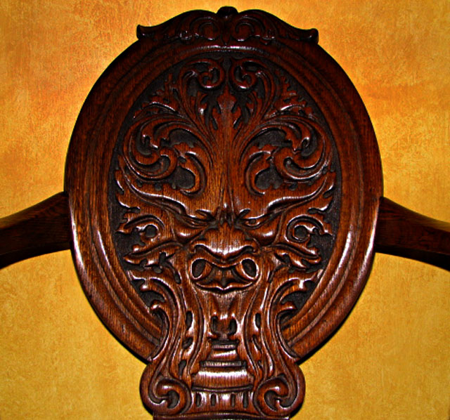
Colors work very well together here, however there seems to be a gradient lighting. Looks as if the on-board flash was used, creating a glare on some of the foremost wood, and fading to dark along the top. Perhaps having the lighting come from the side, raking across the textures of this chair would have created an entirely different and interesting mood. Focus is sharp.
- Linda |
|
 Photographer found comment helpful. Photographer found comment helpful. |
Comments Made During the Challenge  |
|
|
07/28/2005 03:48:15 PM |
| too dark to appreciate detail |
|
| Photographer found comment helpful. |
|
|
07/27/2005 02:26:24 PM |
| I think the colors of the wooden emblem and the wall work nicely together. Also, the engraving and textures are nice. Looks like the lighting (on board flash??) falls off at the top and sides. Also, try a more loose crop, I feel like it's a little 'in your face'. |
|
| Photographer found comment helpful. |
|
|
07/25/2005 07:51:57 PM |
| nice subject...the colors are nice and rich. i'd love to see this with a tighter crop as well. |
|
| Photographer found comment helpful. |
|
|
07/25/2005 02:32:58 PM |
| lighting out - needs greater detail particularly at the bottom perhaps a better angle needed? Nice chair! |
|
| Photographer found comment helpful. |
|
|
07/25/2005 01:24:47 PM |
| Lighting seems a bit harsh. |
|
| Photographer found comment helpful. |
Home -
Challenges -
Community -
League -
Photos -
Cameras -
Lenses -
Learn -
Help -
Terms of Use -
Privacy -
Top ^
DPChallenge, and website content and design, Copyright © 2001-2026 Challenging Technologies, LLC.
All digital photo copyrights belong to the photographers and may not be used without permission.
Current Server Time: 02/01/2026 10:50:58 AM EST.