| Author | Thread |
|
|
08/06/2005 09:48:50 PM |
** Greetings from the Critique Club **
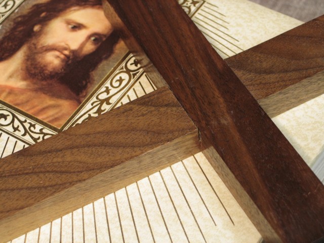
Very moving entry for the wooden challenge. It send a strong message in my opinion. I would have like to see more of the lower end of the cross, but even as is the photo is very nice. The colors are all very complimentary.
- Linda |
|
Comments Made During the Challenge  |
|
|
07/30/2005 11:52:00 AM |
Fit Challenge Criteria: 2/2
Color/Contrast: 1/2
Composition: 0/2
Photo Quality: 1/2
My Subjective Affinity: 0/2
Photo lacks real interest to keep my attention. Lighting is kind of dull. |
|
|
|
07/30/2005 01:12:29 AM |
| My kind of subject, hope ya don't get slammed. |
|
|
|
07/27/2005 08:32:41 AM |
Subject Impact: Doesn't really grab me
Meets Challenge: Meets Challenge
Technical: OK
Composition: Good
Creativity: OK
Score: 4 |
|
|
|
07/25/2005 08:36:29 AM |
| With the cross cropped as it is, it looks almost like an X instead of a true cross. Maybe pan back just a tad. The similar colors of the portrait and the wood are complimentary and the lines of the document run parallel with the cross piece, creating an interesting parallel effect. |
|
Home -
Challenges -
Community -
League -
Photos -
Cameras -
Lenses -
Learn -
Help -
Terms of Use -
Privacy -
Top ^
DPChallenge, and website content and design, Copyright © 2001-2026 Challenging Technologies, LLC.
All digital photo copyrights belong to the photographers and may not be used without permission.
Current Server Time: 02/01/2026 09:06:32 AM EST.